- NEXT PROJECT
- Wild Guanabana - Webdesign
- PREVIOUS PROJECT

- Brands Valley
The Wellness Log is a custom made nutrition and workout program designed to your exact needs, targets and preferences. Working with selected professional conditioning trainers (ISSA), nutritionists (RD) and Chiropractic Doctors (D.C) to identify the best and healthiest possible way for you to achieve your targets. You can also integrate any type of activity of your preference in your program from hiking, yoga, crossfit and/or anything in between. Basically, think of this as your personal guide to a healthier fitter you.
- A 2nd redesign for the product (Branding, Website and Mobile App.).
- Re-build an easy usability experiement for mobile users.
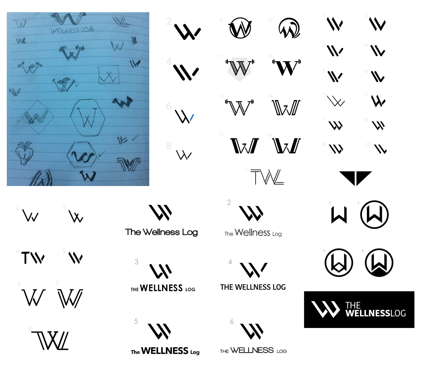
The aim of such rebranding was to create a strong icon that represents the product theme, message and feel.
Sketching over and over, having many feedback in each step; more than 20 options till we reached a final strong icon; Here are some sketches:
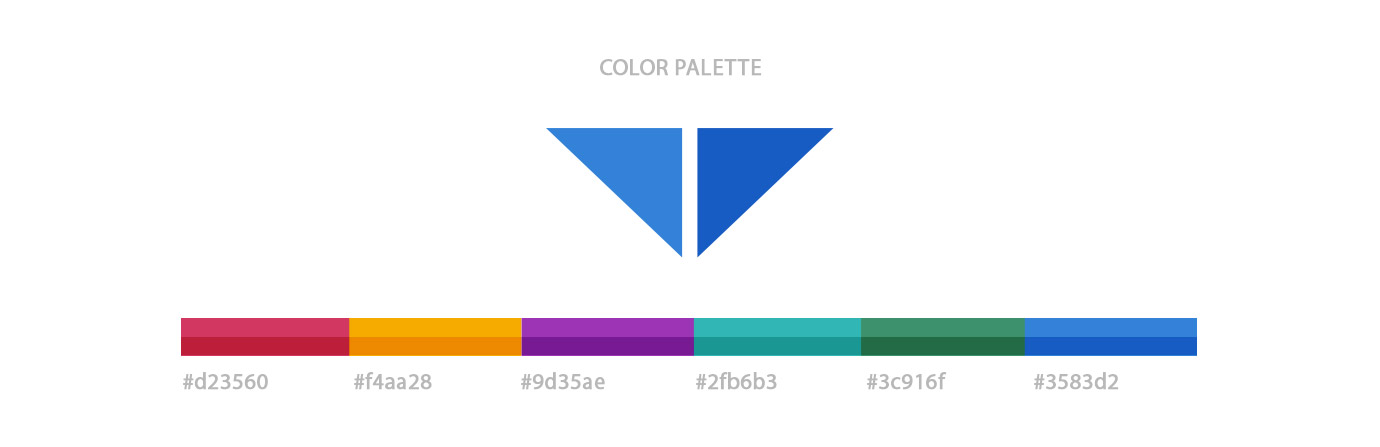
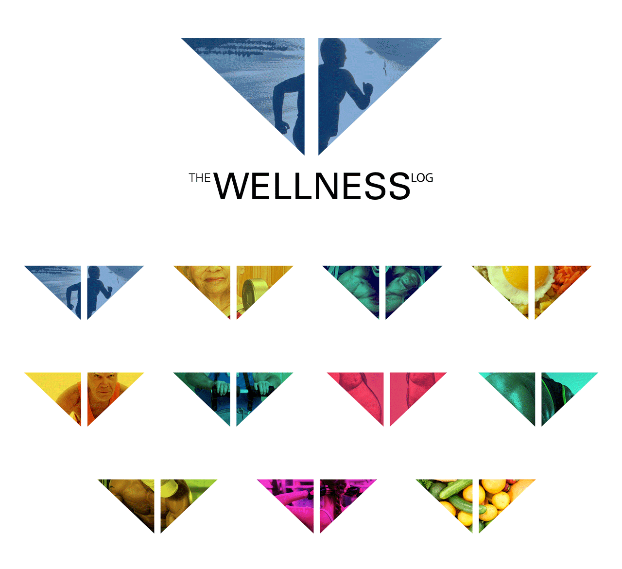
Choosing a color theme was mainly based on Bold Colors, being strong doesn't mean be always in black and white; yet strong colorful palette would fit the concept very well.
This was extremly a great way to best use of the branding; filling the icon shape with different colorful pictures that express the real message and theme of the product, here is an example:
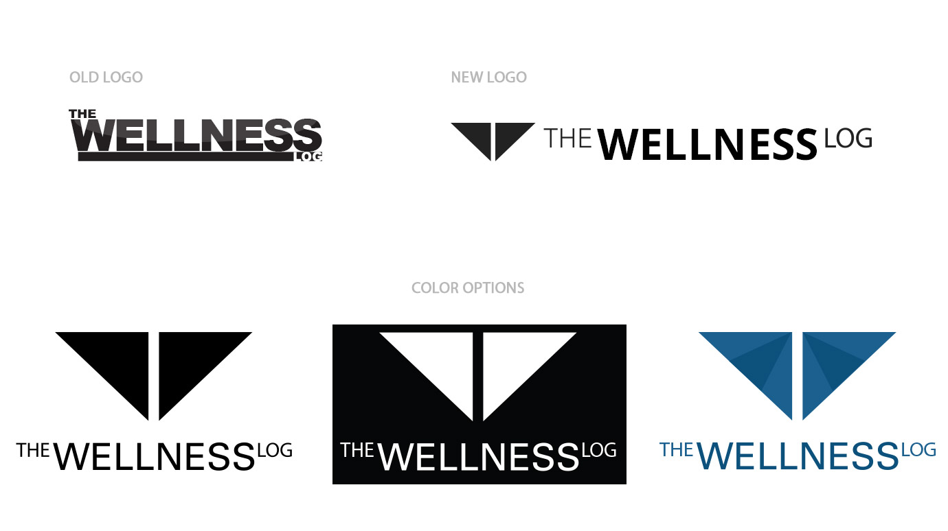
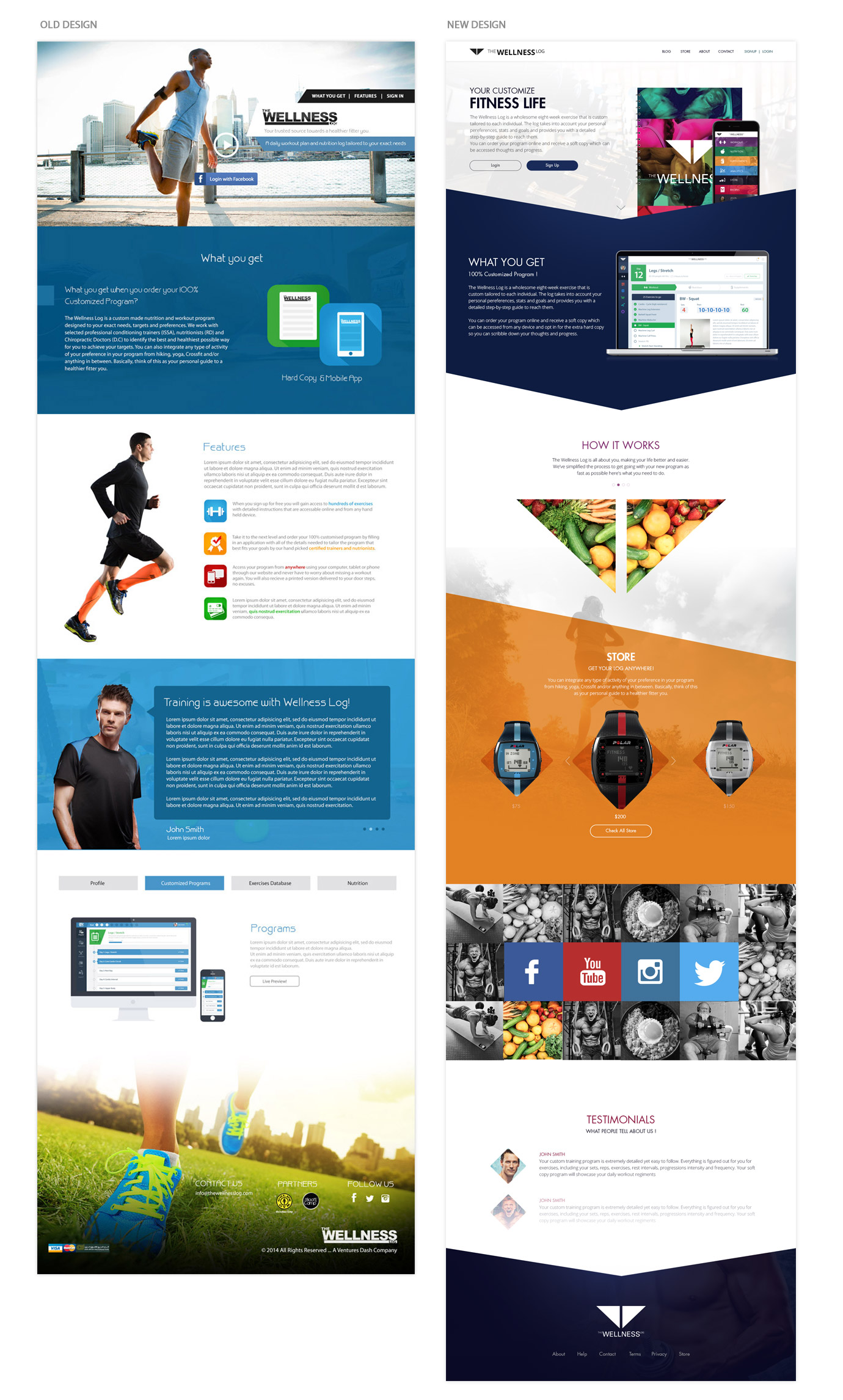
The main change was to make it with more strong shapes, bold colors, direct message and easy access; here is a quick view of The Old and The New design.
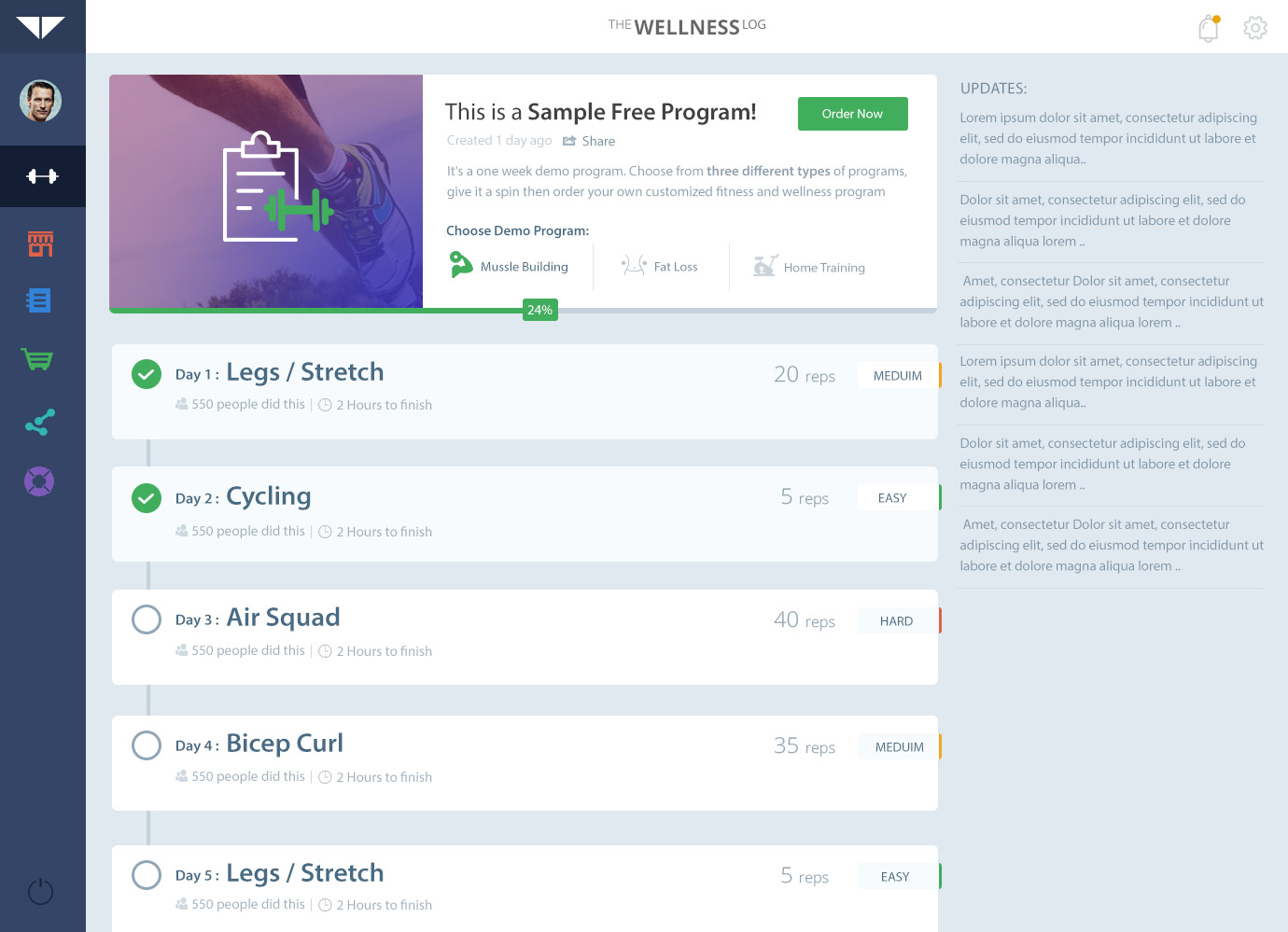
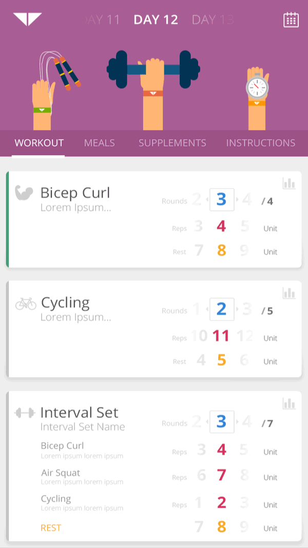
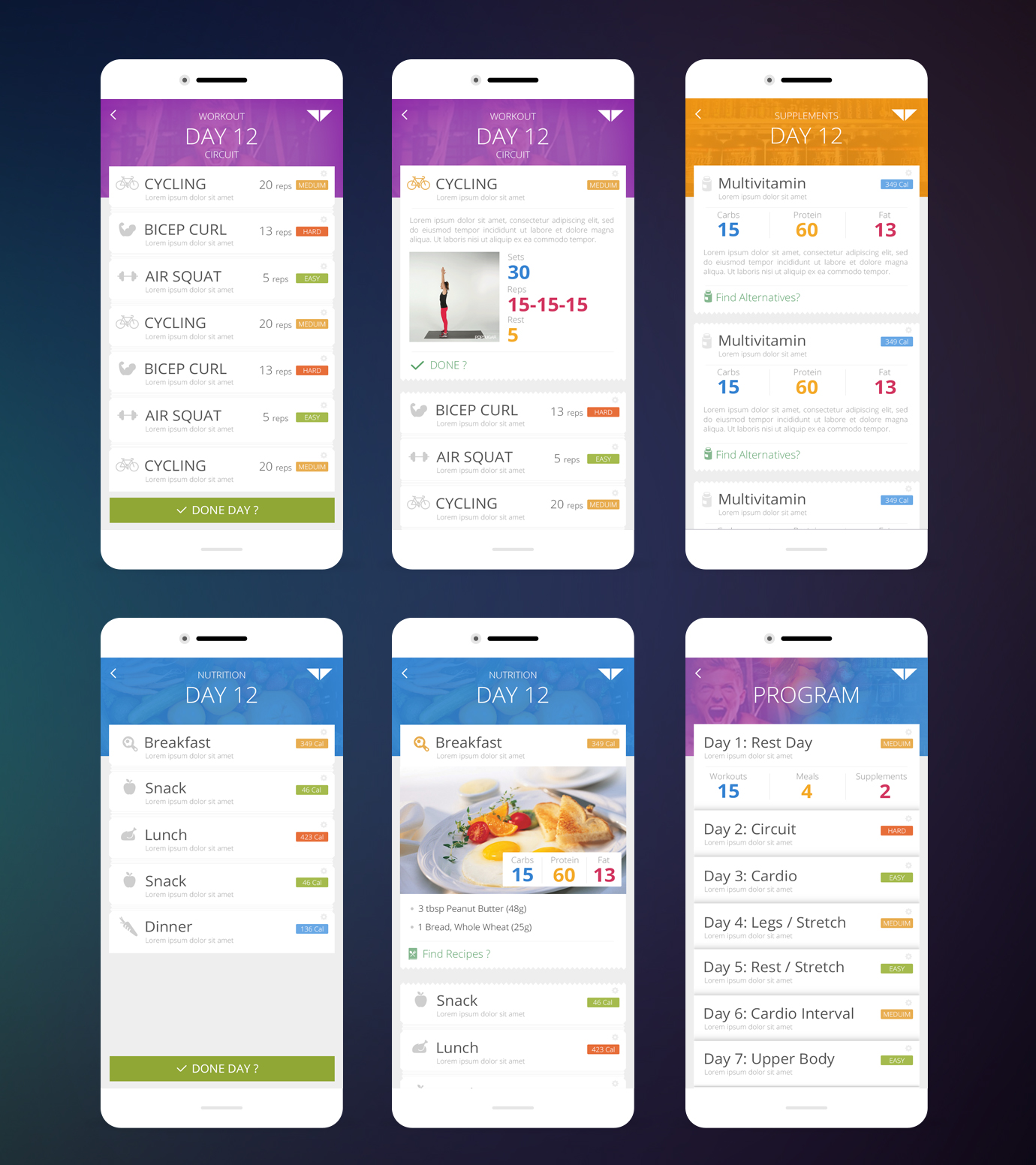
Dashboard is to show the user's program, allows you to follow up with your progress in the customized program. Each day list contains Name, Number of Reps, day level "Easy, Medium and Hard".
Main difference with the new design:
- Smaller sidebar with representative icons.
- More focus on Day List, White Spaces, Font Sizes and light background colors.
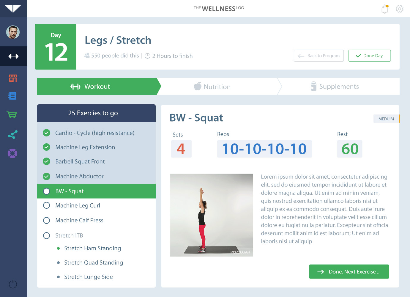
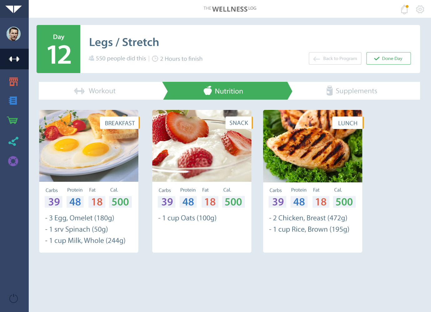
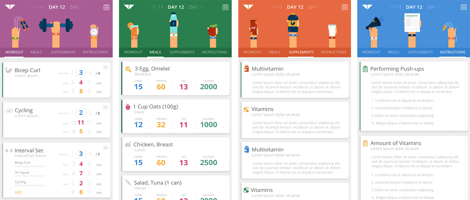
Each day of the program contains specific workouts attached with special nutrition and supplements needed.
The Daily workout shows the exercises to do, with details of each exercise includes Sets, Reps and Rest Periods; attached with a GIF explain and a written brief of the exercise.
The nutrition needed for each day, attached with different photos and recipes for the specific meals.
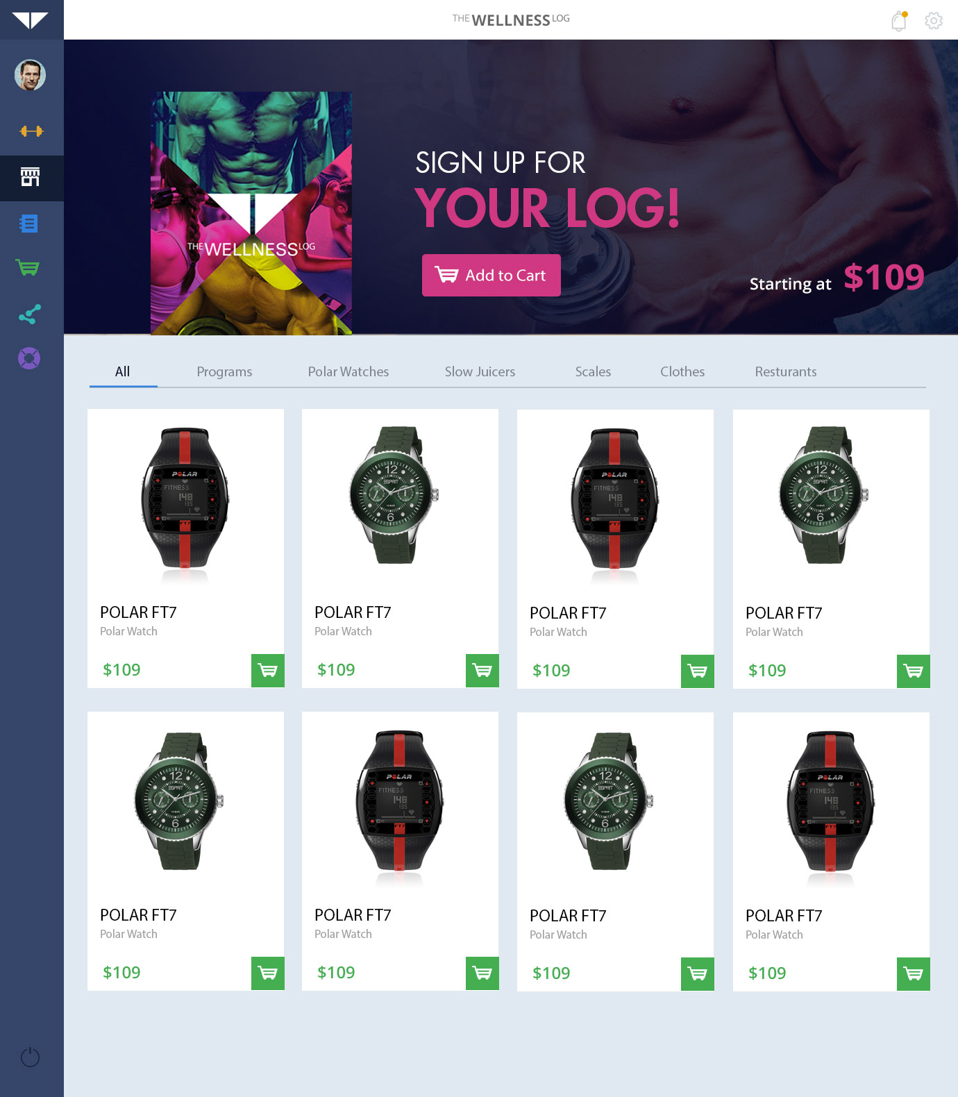
An online store to view different products powered by "The Wellness Log", as well as their main product The Customized Log itself.
This was a sample of what it is going to look like:
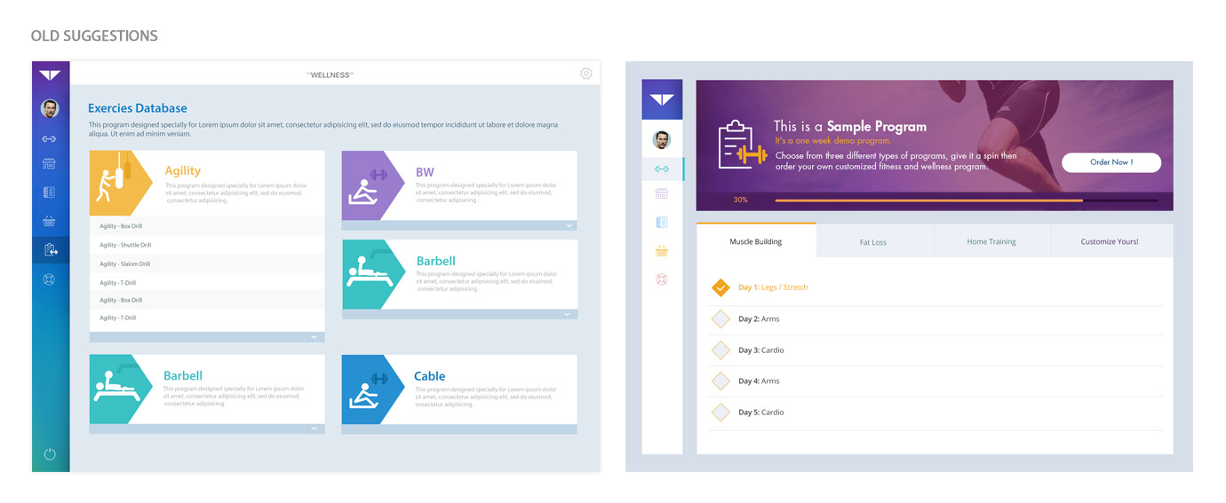
Suggestions for "Exercise Database" and "Program Day" pages; However designs had so much colors that make user dosen't know exactly where to look first.
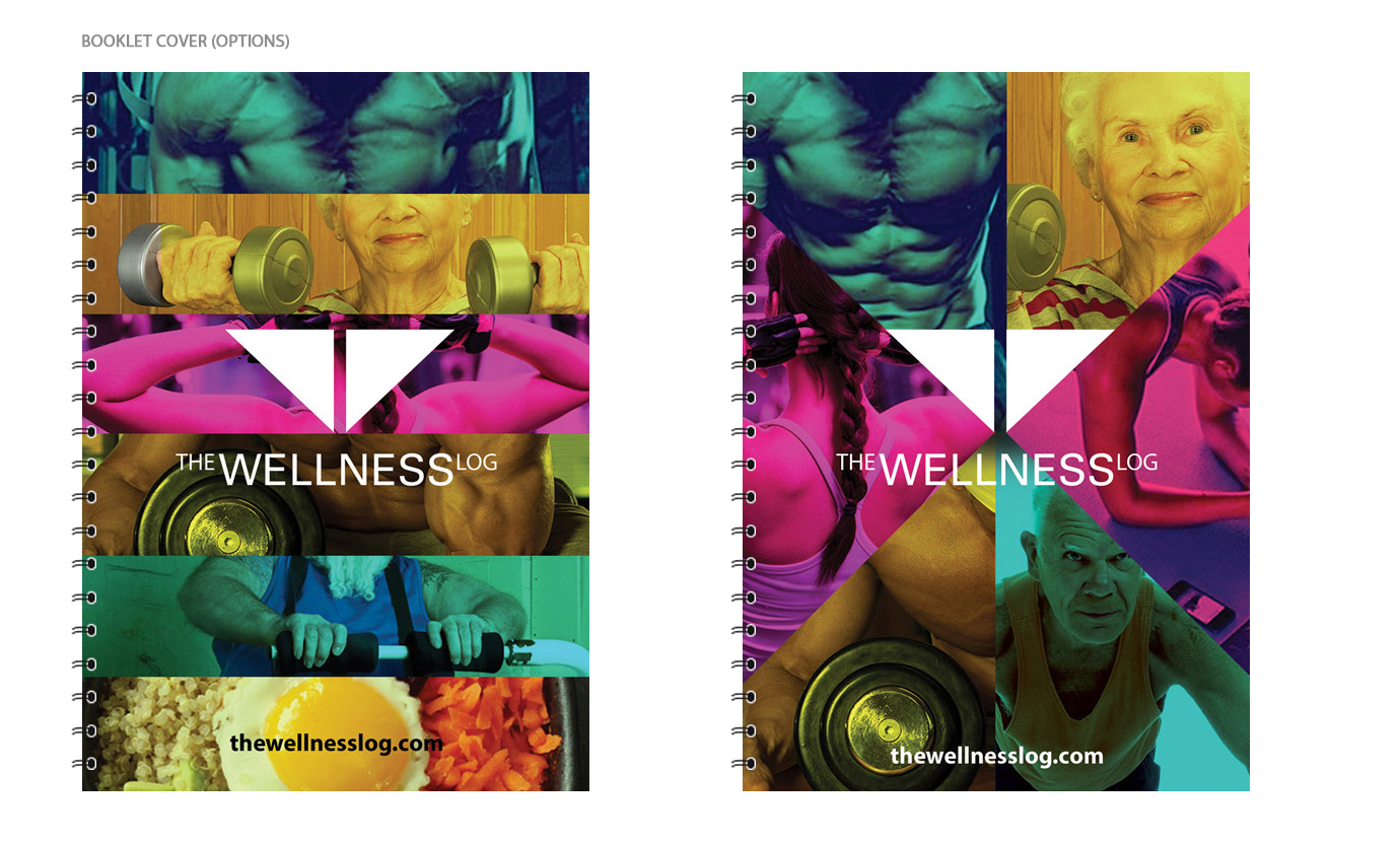
Options for the booklet "Customized Program Log" cover; using bold and strong colors, matching with logo curves.
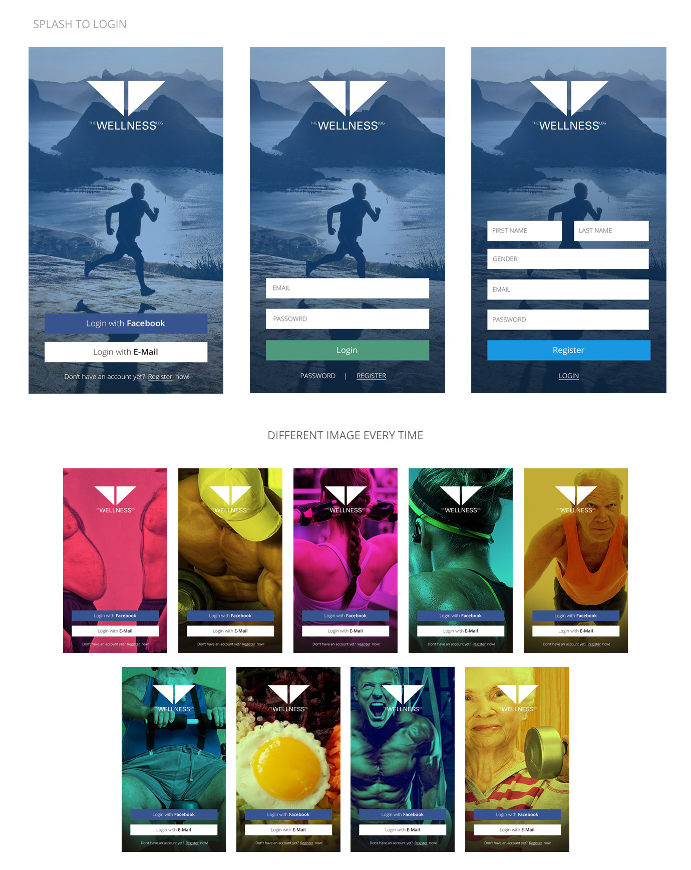
Different images with bold colors slide quickly inside the logo shape, the shape then enlarged to fit all screen, each time will generate a different random image as a background for Login/Registration; Here is a quick view of the concept:
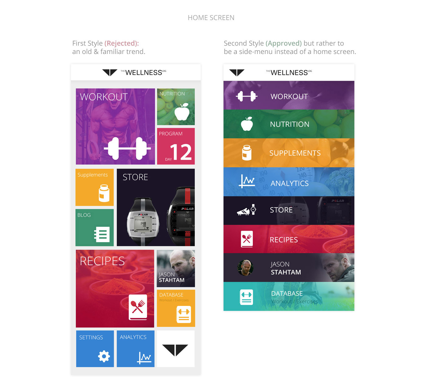
This particular screen has many debates and feedback; On which screen should the App. start ? Do we need a home screen to summarize all the App. options ?
We started with a basic Metro Style "Left" with bold colors to highlight the most needed options to user; however this style was a bit old trend that might not be the best solution.
So, we decided to minimize it to a more neat option "right" with direct slim spaces and same strong colors.
Nonetheless, after many talks we decided not to start the App. on a Home-Screen, rather opens on the program workout/nutrition directly to make it much faster and efficient to user; while we keep this same design to act as a Side-Menu all over the App.
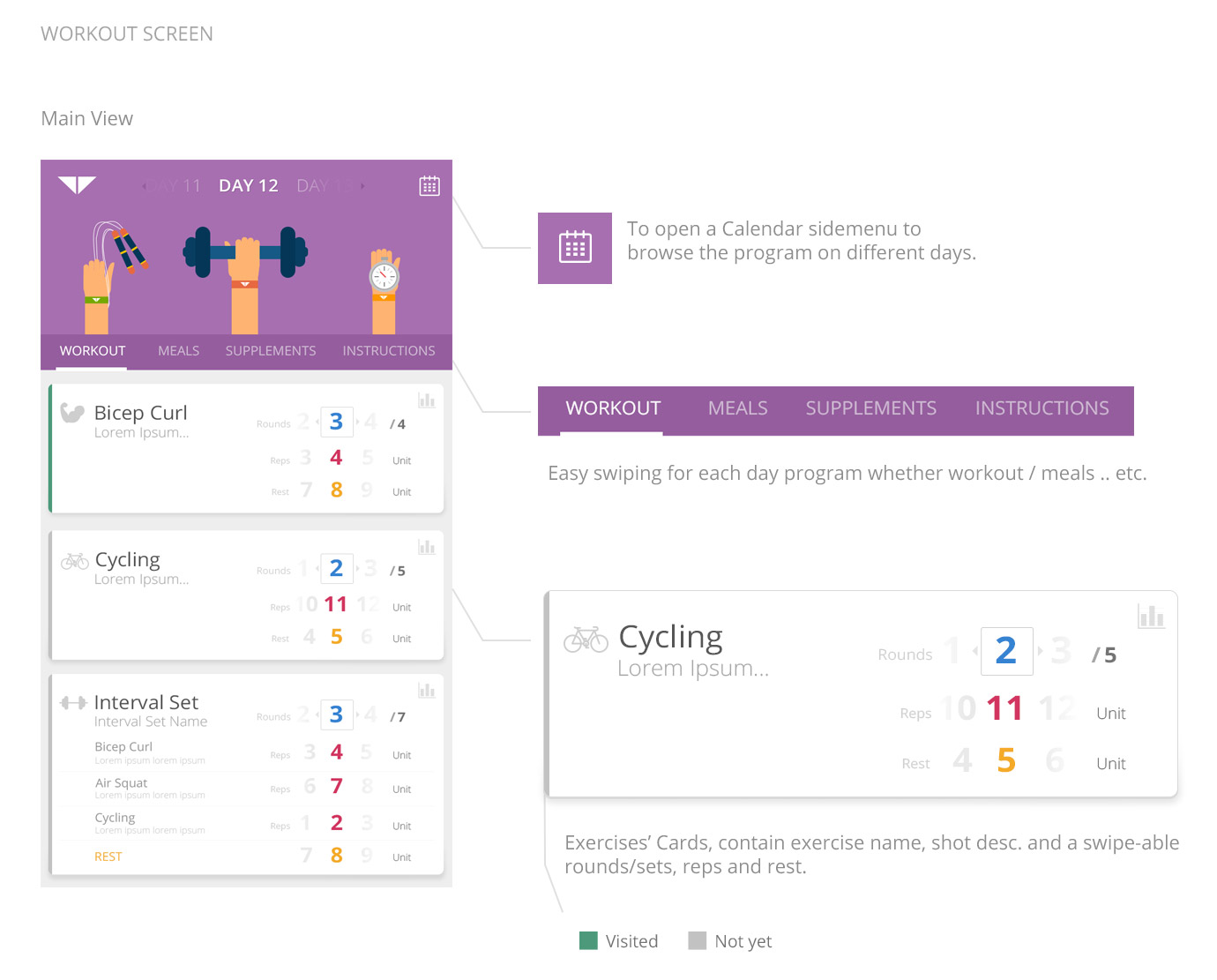
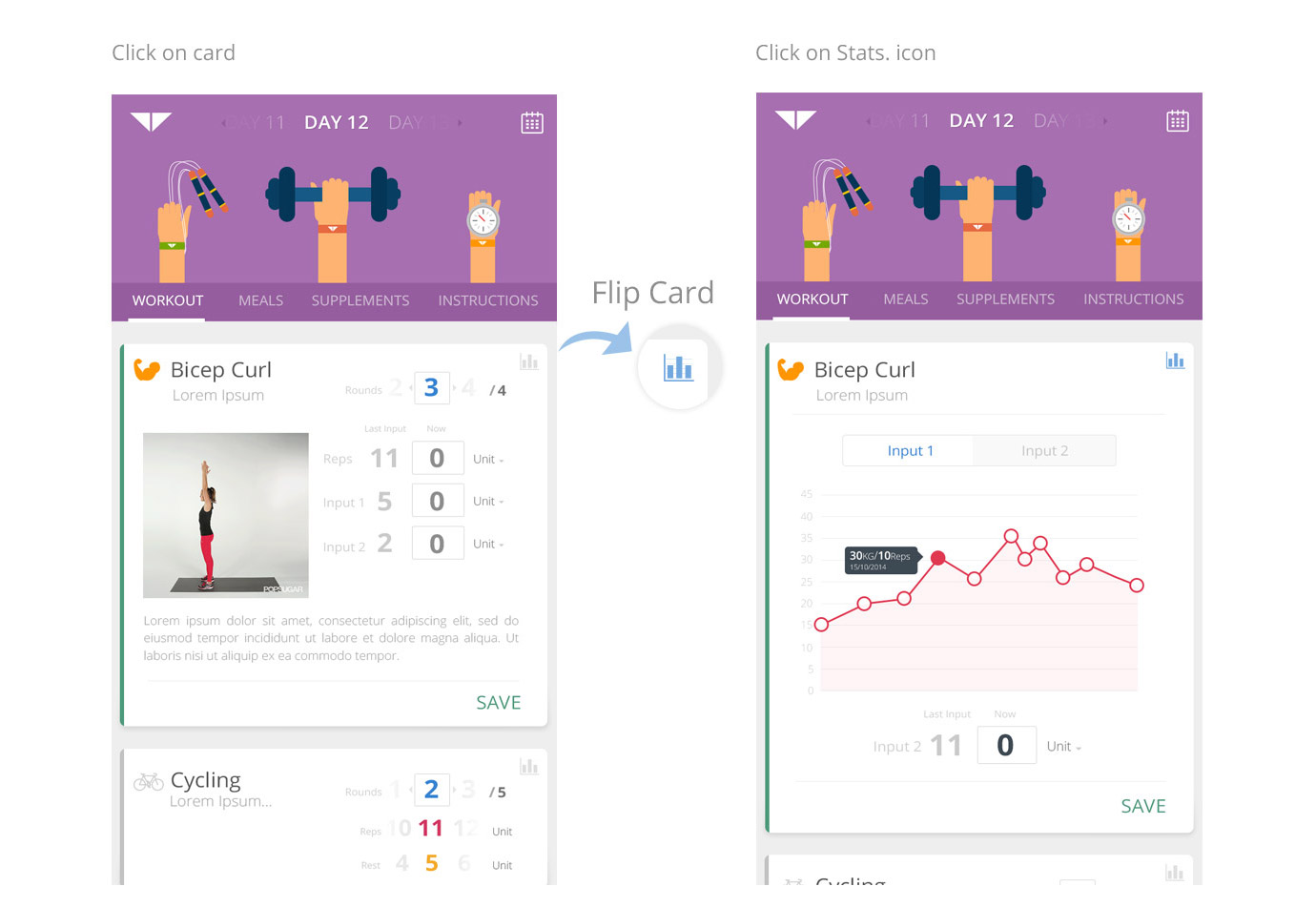
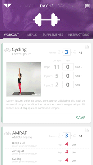
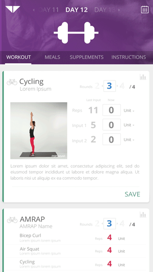
Main design concept was based on Google Cards; we were trying to make a smiliar view that makes exercises' list as cards with feel of paper on screen, that was a bit hard due to the large data attached to each workout and needed to be shown on every single exercise card.
We had many approaches to deal with each card:
- Default: to show main exercise data that needed to start trainging.
- On Click: to expand the card to view more details of exercise, describtion, photo and to EDIT/ADD your inputs then save.
- Stats. icon: on very top right there is a small icon to show stats and charts of your progress to each exercise; editing your inputs as well.
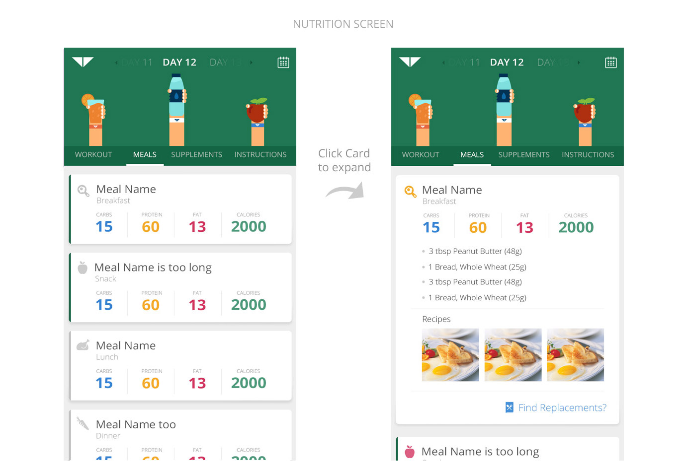
To show the attached meals to your day within your program; with option to expand the card and show more details; different recipes and even to find alternatives within same "Carbs, Proten, Fat and Calories".
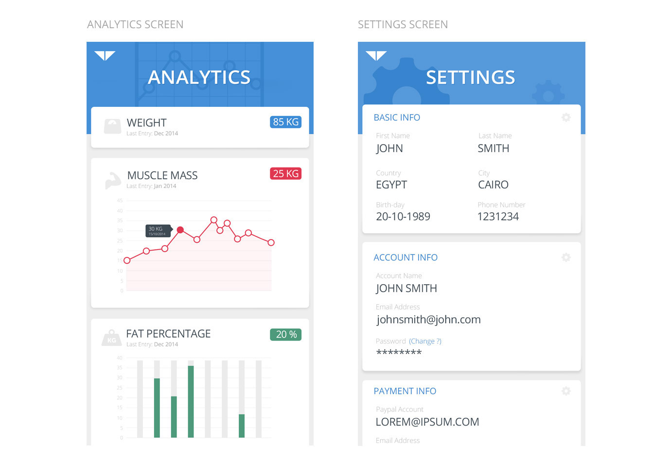
Analytics is to show different charts and stats. about the user's own performance; based on his inputs in each exercise.
Settings is to change all "Basic, Account and Payments .. etc" info; with single "edit" icon in very top right corner.
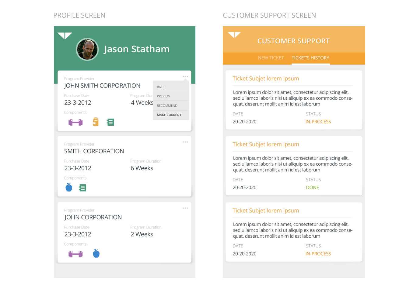
Profile screen is mainly to show your previous programs, with options to "Rate, Preview, Recommend and Make it your current program".
Customer Support is a regular support tickets system with a tab to follow your previous tickes.
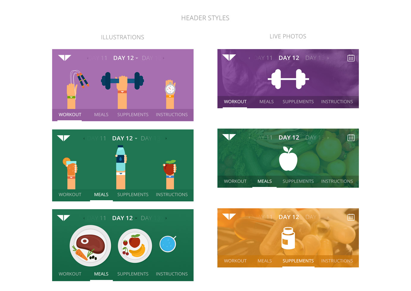
I liked to try different styles for headers; specially "Workout and Nutrition" as the user going to see them most of his time using the App.
First style is illustrated hands holding elements for each category; with flat and solid colors.
While second style is using Live Photos; which is more compatible with "Home Screen/Side Menu"; Have a look on both:
First Side Menu "Left" is acting as Main-Screen, it shows when you click on "The Wellness Log" icon on top left, enables you to navigate through main options like "workout - nutrition- store - settings ... etc".
Second Side Menu "Right" is a small swipe that brings in the list of days, a bigger swipe includes sessions, date of month, and day of week. With a 'skip' option to move the list downward and a 'rearrange' to move days arround.
Those are couple of screens I made before, slightly changes in style of cards, font-sizes, style of header and amount of colors.
- There is nothing better than testing designs on "real" phones; to know the best font-size needed for each specific part; what colors might look disturbing to users .. etc
- Having many sets and talks with a product owner is very useful as s/he might be the best user of the App.; s/he knows well how customers are using his product; so don't assume solutions unless you got the whole view.
- Make as less screens as possible; adding the most needed features to users first; then eventually think of adding more features/options in appropriate places in your design.
© 2015 All Rights Reserved / Designed in "Ventures Dash" Company.
More about team: Ventures-Dash