- NEXT PROJECT
- Keven Spacey - UI/UX Design
- PREVIOUS PROJECT
- SoundCloud-Redesign Concept
The Wellness Log is a custom made nutrition and workout program designed to your exact needs, targets and preferences. We work with selected professional conditioning trainers (ISSA), nutritionists (RD) and Chiropractic Doctors (D.C) to identify the best and healthiest possible way for you to achieve your targets. You can also integrate any type of activity of your preference in your program from hiking, yoga, Crossfit and/or anything in between. Basically, think of this as your personal guide to a healthier fitter you.
- State UX concept that matches with such type of data, users and interaction.
- Re-build a UI Design for web/mobile app. that matches with brand identity, which was only one color .. Black! I wasn't the Front-End Developer in this project.
- Providing Social Media Ads. Concept, as well as designs for Printed Flyers & Booklets.
The data related to the product "The Wellness Log" wasn't so much to be shown in seprate pages; However the main focus was on the product and "program" pages rather than "About" section.
So, We decided to show all related data in one single page, with options to login/register, Here comes the result:

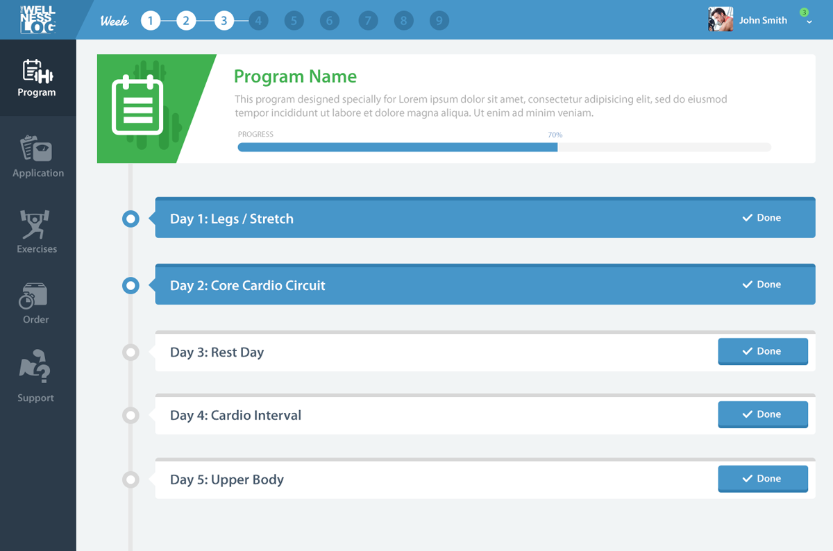
This is the main dashboard for the user's program, allows you to follow up with your progress in the customized program.
Each day contains several exercises (attached with nutrition needed) for your program period. The very top timeline is to follow your 8 weeks program; where is my progress and what should I do next.
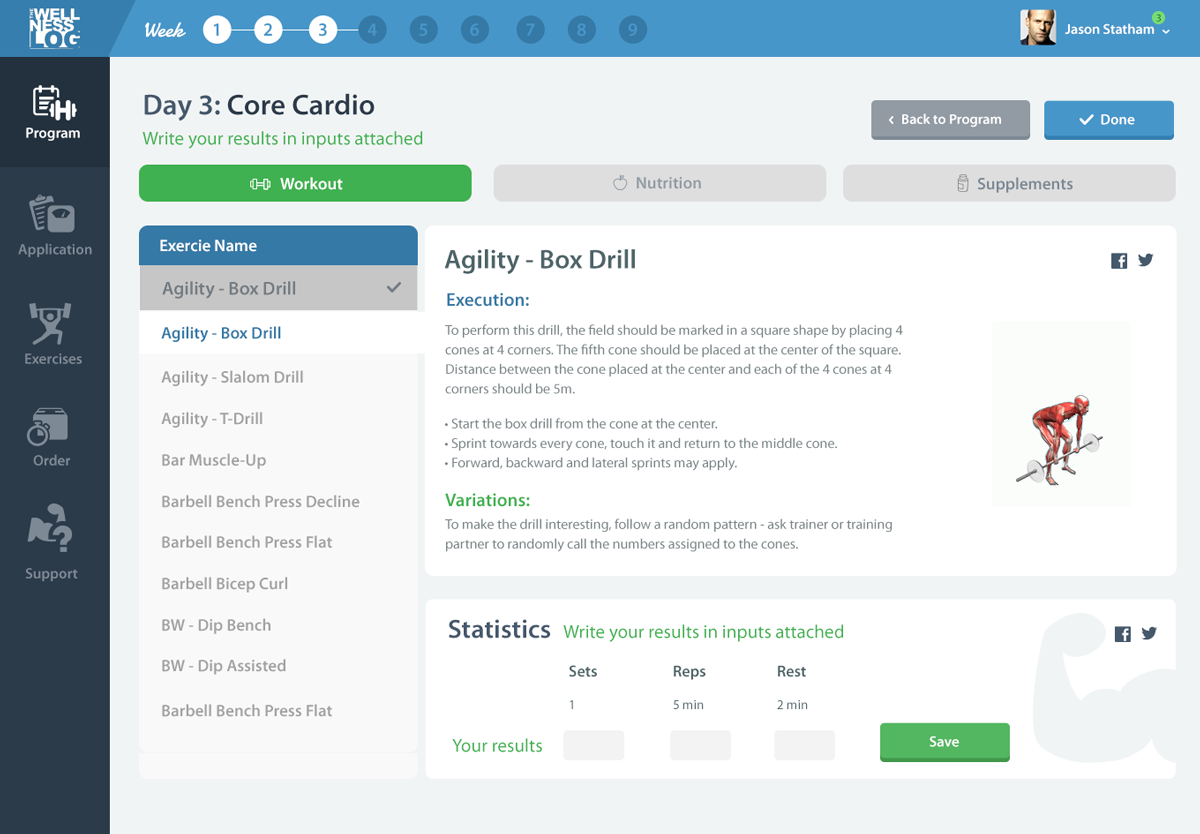
Each day of the program contains specific workouts attached with special nutrition and supplements needed.
You should write your number of Reps and Sets for each exercise.
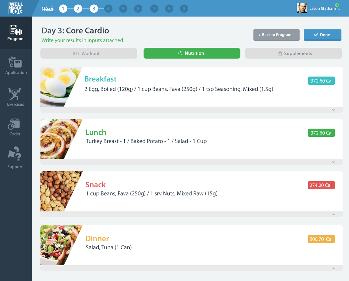
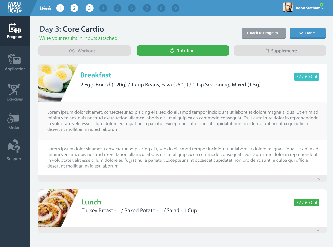
The nutrition needed for each day, attached with different photos and recipes for the specific meals.
When you finish the day just click DONE !
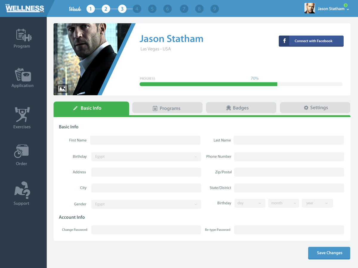
I wanted to make a sharp and easy profile page that allows you to check your progress, badges, programs and account settings, while you can simply edit your data within clear forms.
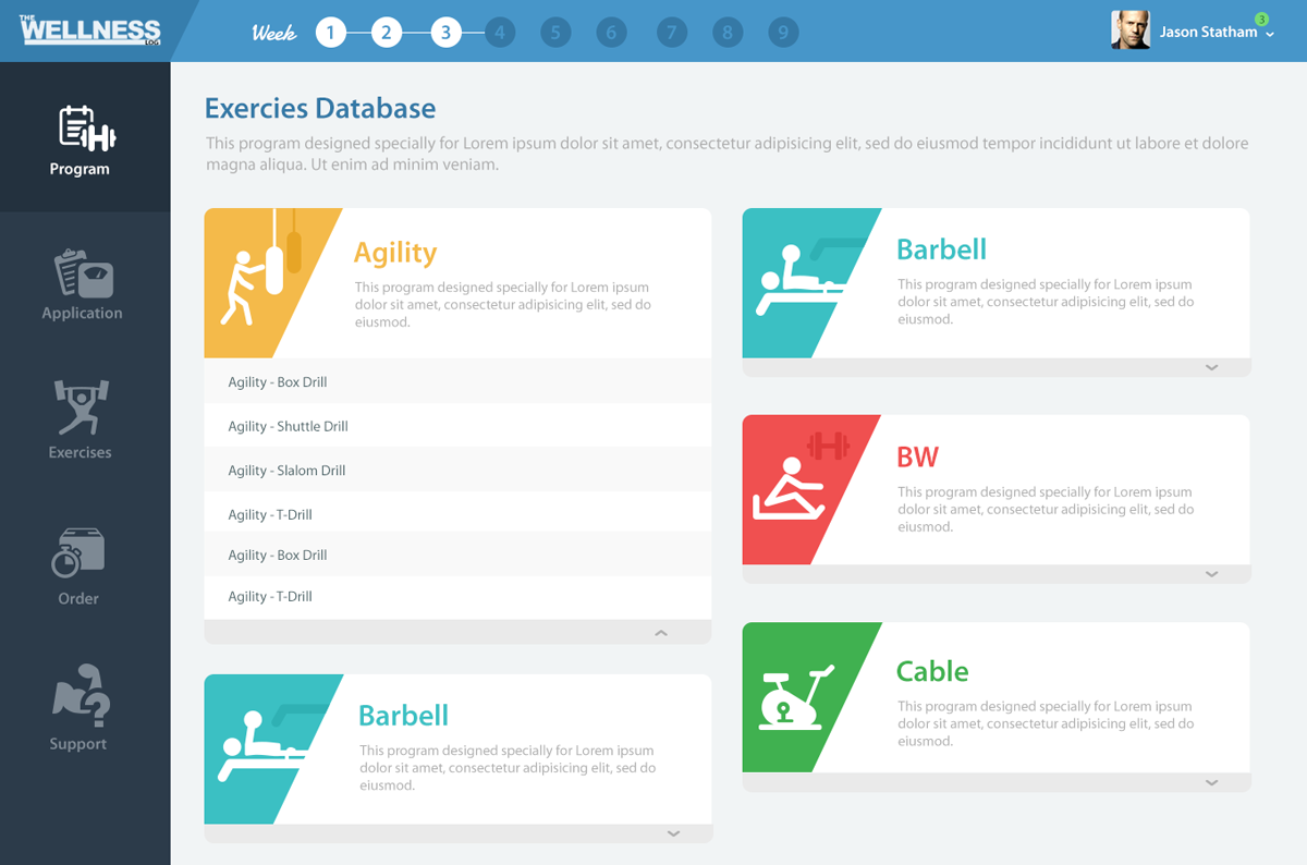
A huge free database for most common exercises, which can be a useful resource for many people.
I liked to make it easily accessible, adding some bright nice colors for them to separate types; with simple icons that could make this single page as a separate product itself!
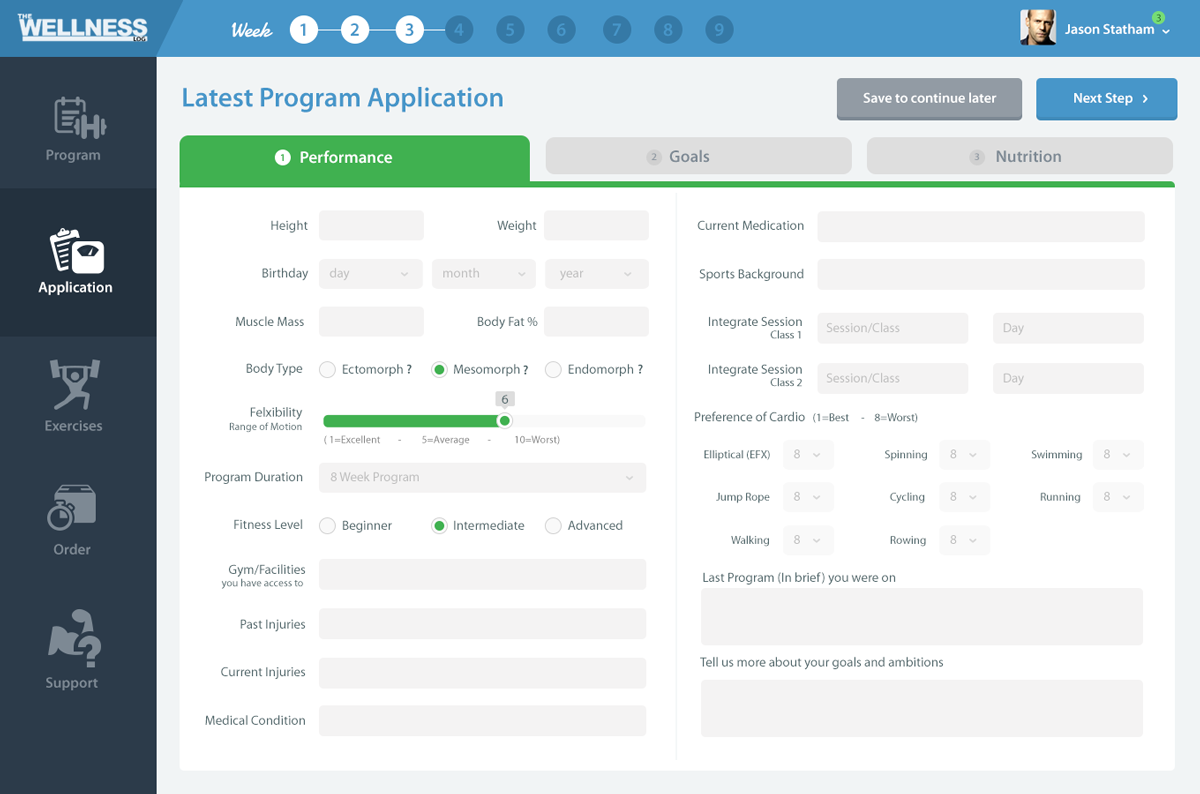
This was "and still" one of main concerns in UX Design, how to handle large amount of "Forms" that needed to be filled; while keeping the user willing to fill them all without feeling bored.
I personally took the formal way and made it in steps; I just tried to make them look readable and clear. Within this page you can fill out the application to get a customized program that fits your needs.
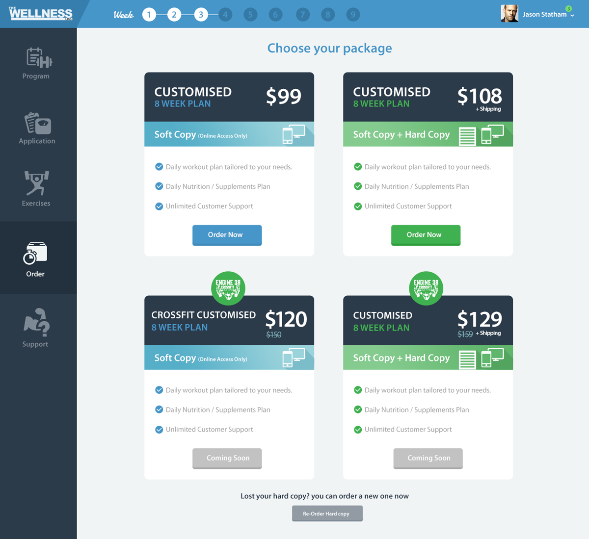
Different plans to book your order of the log; either as "Hard/Soft Copies" or just a soft copy.
We had many discussions on whether we need a separate mobile app. experience or just using the same responsive web-version; I made suggested designs for the app. concept; here are some of them:
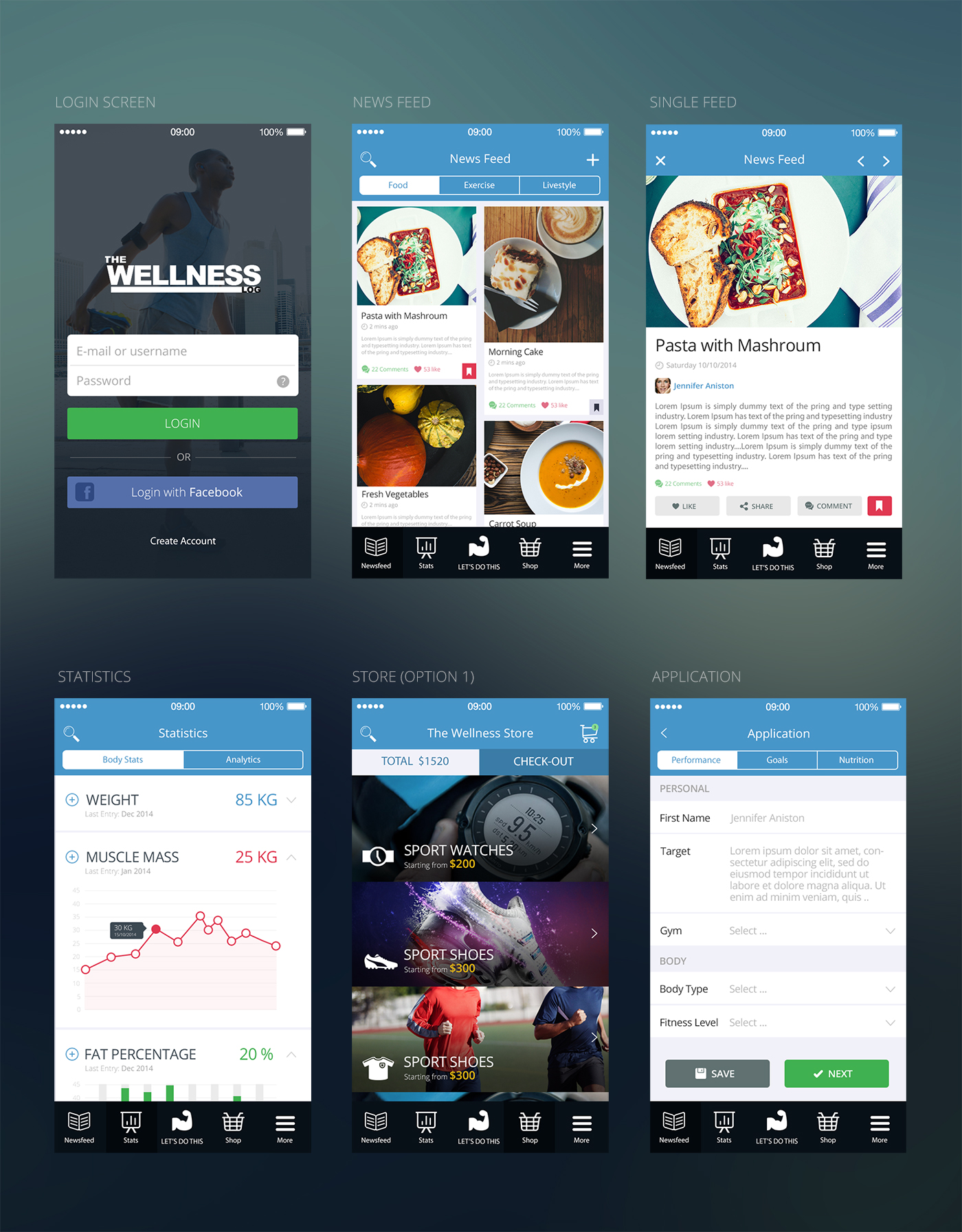
An attachd store that sells related fitness products powered by "The Wellness Log".
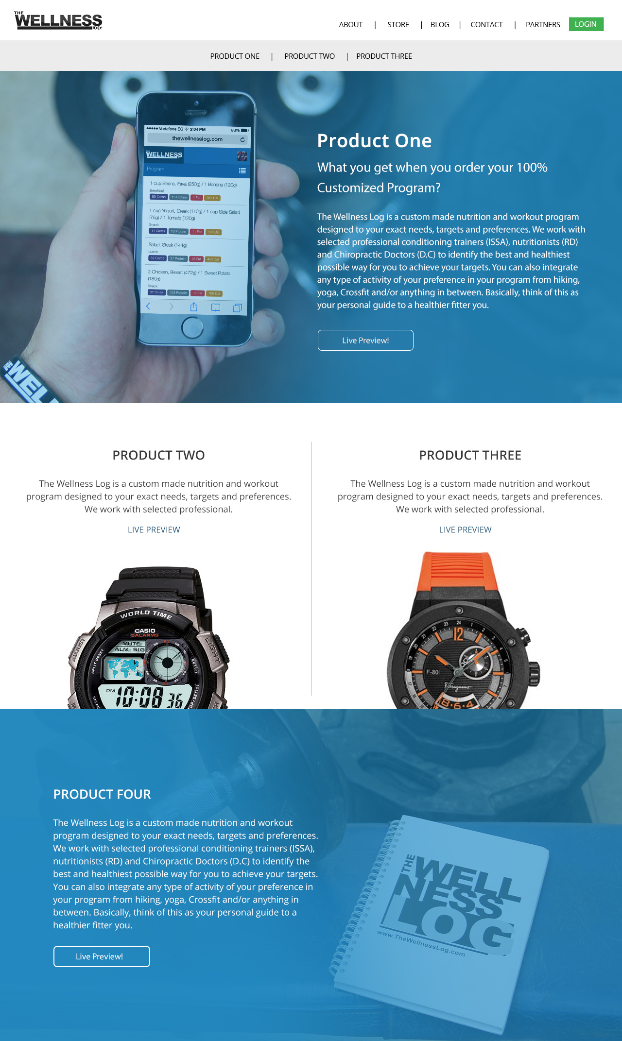
This was a landing page highlighting main products.
I made illustrations and storyboard to a one-minute motion graphics video to promote the product and to be added in homepage header. Here is the final result:
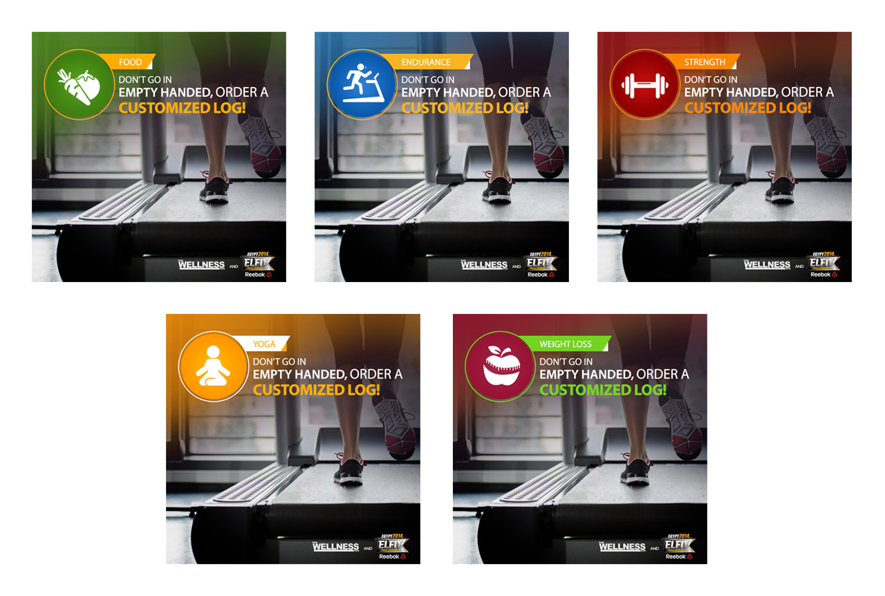
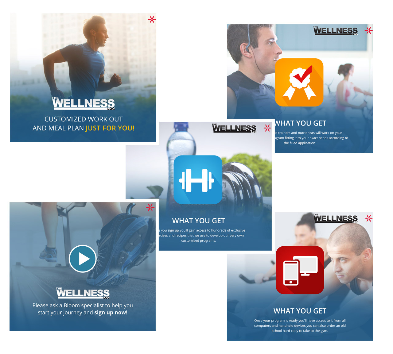
I also worked on some designs to be used in social media marketing, building simple theme to be recognized once seen; using light color shades; bold iconic colors "yellow, red and green".
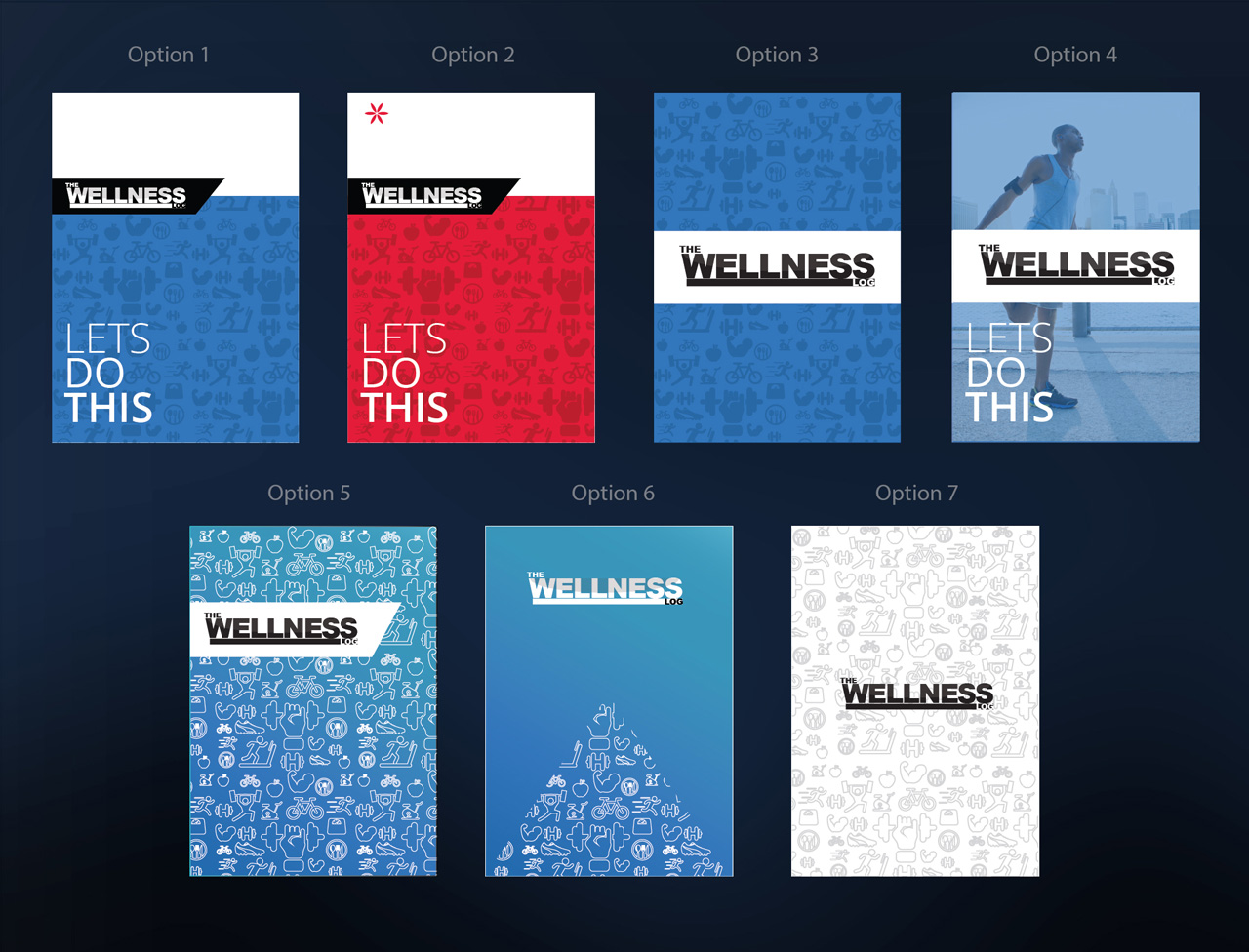
Few suggested options of the booklet "Customized Program Log" cover; using some outline fitness icons with few shades of blue.
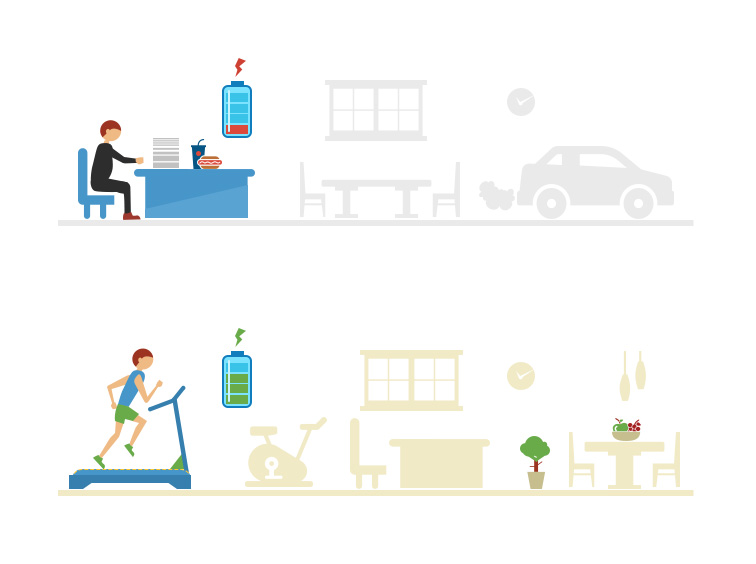
Illustrations used in some product presentations; aiming to simplify the product; comparing between regular life "top" which consists of only "work & eat" life routine depends on cars and seats; while the healthier life "bottom" consists of workingout; eating healthy and having much more power.
- There should be a good mix between font-size and white spaces; cause when it comes to webdesign, smaller fonts are the best; with no smaller than 12px.
- Some usability solutions might work well on large screens and web users; but not very well for mobile users; in this particular product I had to redesign a whole complete experience for mobile users; but that was after recieving many feedback from mobile users saying they only use the product via their phones and they can't reach what they need easily. However this design concept fits well if the product is only used with large screens.
- Never accept your output quickly; try to get heavy feedback either from professional designers, owners and regular users.
- And one more thing ! ... Don't make large sidebars.
© 2014 All Rights Reserved / Designed in "Pink Panther Laps", a "Ventures Dash" Company.
Front-end Developer: Zyad Sherif
Back-end Developer: Mohamed Said
Check live: Thewellnesslog.com