- NEXT PROJECT
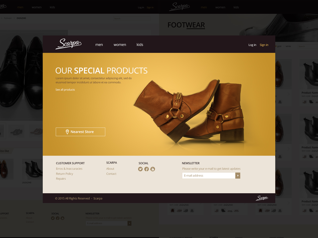
- Scarpa - Online Store
- PREVIOUS PROJECT
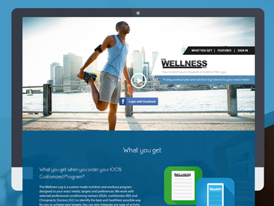
- The Wellness Log 2014
The Middle East Theatre Academy (META) and The Kevin Spacey Foundation (KSF) are proud to present Home Grown, the region’s first innovative philanthropic programme to discover and nurture young artistic talent in the performing arts, as well as to provide creative opportunities for youth throughout the region.
- Using the brand guidelines well to design the main website; stating UX Concepts for applicants and make it easy to understand all conditions and requirements; dealing with many details and text to be added.
I wasn't the Front-End Developer in this project.
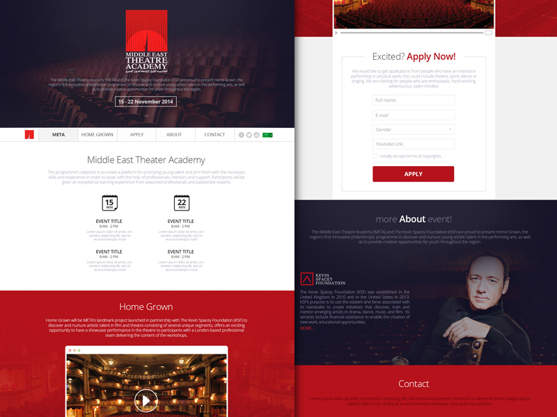
Analyzing the inputs; requirements; guidelines and application fields to start building an easy layout that doesn't feel so long when scrolling; while adding as much information as possible.
I came up with two suggested designs; generally they may look the same but with some tiny edits in pictures, sections orders as well as some tiny usability issues.


As we got too many data to show in one page; while still like to make it only one page website, we had to add tabs in some sections to avoid going to other separate pages.
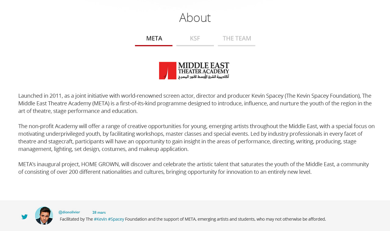
Providing the website in Arabic Language as well as in English, this requires to pick a clean Arabic web-font in order not to be so different than English version; (Arabic Language is Right-to-Left).
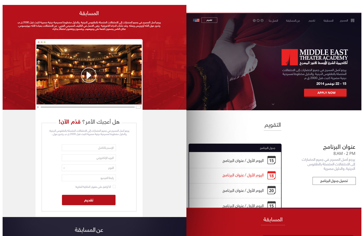
- Making a Single-page website to present large data is not always the best choice; specially when you've process & terms that users should read and follow precisely, this will force you to separate pages even for a faster reach by users.
© 2014 All Rights Reserved / Designed in "Pink Panther Laps", a "Ventures Dash" Company.
Front-end Developer: Zyad Sherif
Back-end Developer: Mohamed Said