- NEXT PROJECT

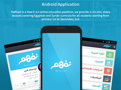
- Nafham - Mobile App.
- PREVIOUS PROJECT

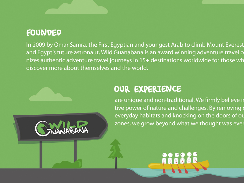
- Wild Guanabana Brochure
Nafham “in English: we understand” is a free K-12 online educational platform started in 2012, the first and largest in Middle East. Providing 5-20 mintues video lessons covering Egyptian, Syrian, Al-Geria, Kuwait and KSA curriculam for all students starting from primary 1st to end of High School.
Lessons mainly come as "Crowd Sourcing" from whoever finds himself able and willing to teach specific topic, either Formal Teachers, Parents and even Students !
- In 2013 I was the First Designer to be hired in Nafham; I was responsible for rebuilding the website with new UX Concept; adding new features for students, teachers and parents.
- Design a Mobile App. that facilitate the service for students; as well as a Smart TV App. to be used by several targeted users.
- Using the brand guidelines preciesly to build a design theme to be used in Social Media, Advertisments.
- Front-End Coding using Twitter Bootstrap 3.0 framework.
-The Website Mainly in Arabic Language (Right-to-Left); as its only targeting Arabic Speaking Students with online materials only in Arabic; and that was the first in kind as a platform that has a fully functional dashboard with plans to be totally a gamification website!
- Every single design step had several discussions, feedback from different team members and active users to ensure the easiest usability for users; as they may differ in their understading of computer; browsing and online teaching.
- One of main adventages in "Nafham" is their founders; they both were Past Designers with experience ranging from 5 to 10 years ! which helped me a lot to enlarge my knowledge and sharpen my skills in many different ways.
Main target for the homepage is to be "Easily understood" by all types of users ! Parents, Teachers, Students and even Kids! which is pretty hard to deal with many different categories; That's why we tried to make it as simple and clear as possible; with very catchy titles and "Subjects Dropdowns" to quick access to the online material ... Have a look:

- Dashboard meant to contains the student's current subjects in his registered studying year/class, S/he will be able to browse his subjects with its lessons, and following his/her progress in each subject (based on the views of lessons), S/he also has the choice to browse the official school book as PDF in case the book is not avilable or needs to follow with the lesson directly.


A simple statics page showing his/her progress through "Nafham Website", Lessons watched, Total Points, likes "understands of his/her own lessons", and a small "blue" section that suggestes "lessons" that needed to be explained.


This is the main page in whole process; it shows the lesson as a Youtube Video with its own Different Parts, Exercies, Questions and Answers, Comments Experiements, Exercies, Different teaching ways, Related Videos and Number of likes or "Understanding" of the lesson.


A separate system for Questions & Answers, either on specific subjects or general scientifical topics. The design shows a main question with number of answers attached, an integrated comment system to enrich the "Student & Teacher" engagement, with a small section "left" to show you un-answered questions if you'd like to answer.

The main goal of this Simple Blog page is to give a feel to students that you can browse even more topics than your own school subjects, The blog was to show Topics, Articles, Debates in different Fields either written by Nafham team or imported from some scientifical sources.

Quick and summarized about page to give a conculosion on what is it all about. Highlighting ways to communicate with Nafham Team.

I've conducted many infographics to simplify and visualize the whole idea; this particular one made to explain how "points" are calculated in the monthly competition among Students & Teachers.

We delivered designs for a Smart Tv App. to be used by several users in their homes/schools. A Simple design with quick "call-to-actions" to facilitate the educational goal of the product, easy to use by different users.

At some point I had a concept to simplify the "Nafham" idea in 30 seconds motion graphics video, I made the concept with reasonable illustrations & animation that made on board & chalks theme to give the feel of schooling. Unfortunately the video wasn't published but it was a nice try to mention.
Some Frames from the final video:

At early 2014 before I leave "Nafham", I started on new design concept to follow the viral trend of "Flat"; I thought of being more flat; no-borders, more white spaces.
I've illustrated around 20 different subject icons with different colors to match with the Gamefication Concept, Here are some of the concept:


Working more than 15 months designing with continuous developing of one single product is very helpful to gain "in-depth" experience in many design fields; as you go through many issues that you might not face when working on different small products, and Sure in such cases you have many things to learn ! examples:
- Adding many graphics elements in some cases might affect badly the website usability; it might not be so useful in a very sensitive product that deals with many users, cultures, students and parents ! Using as few simple graphics as needed just to simplify the process instead of using complicated text.
- Dealing with huge text and data website requires to make a smart use of white spaces & font-sizes ! That's all what matters when comes to reading and browsing many choices in small screen; people needs to read quickly in a very comfort environment, no need for too many borders!
- Don't make it hard on users to use your product ! No need for "too long" registration fields, if so needed, don't make it all on one phase. Just get your very basic requirements and give him the choice to complete later; If s/he really wanted to use your product to the max. s/he will get you all information you need.
© 2013-2014 All Rights Reserved / Designed in "Nafham Education Co.".
Co-Founders: Mostafa Faraht; Mohamed Habib.
Back-end Developer: Mohamed Said
Check website live (design not mine): Nafham.com