- NEXT PROJECT
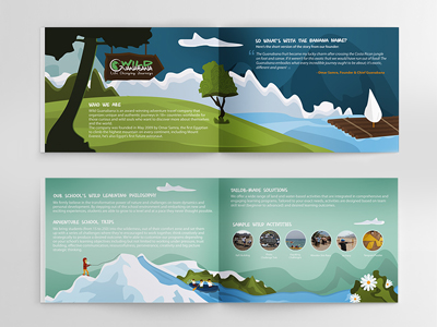
- Wild Guanabana Brochure
- PREVIOUS PROJECT
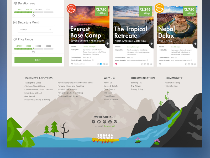
- Wild Guanabana Webdesign
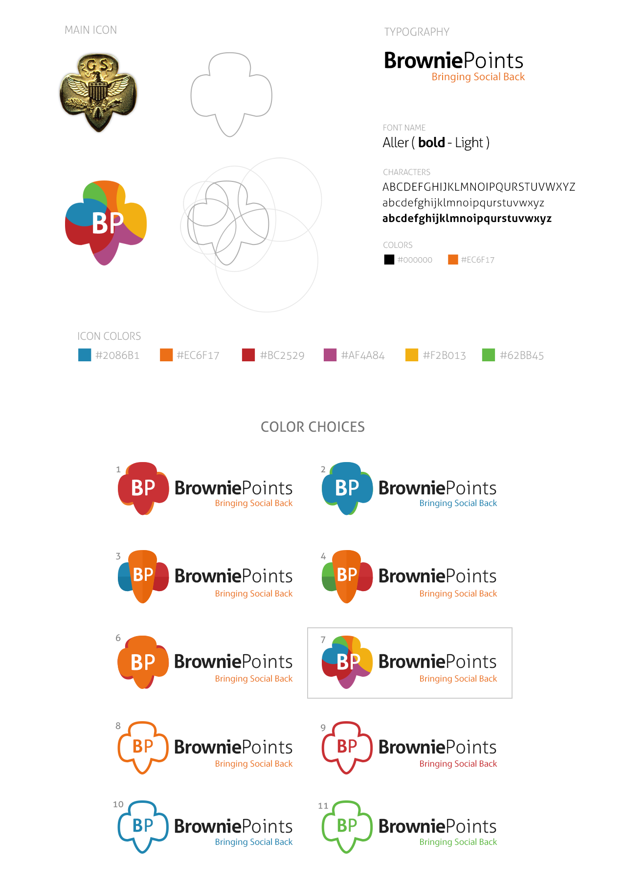
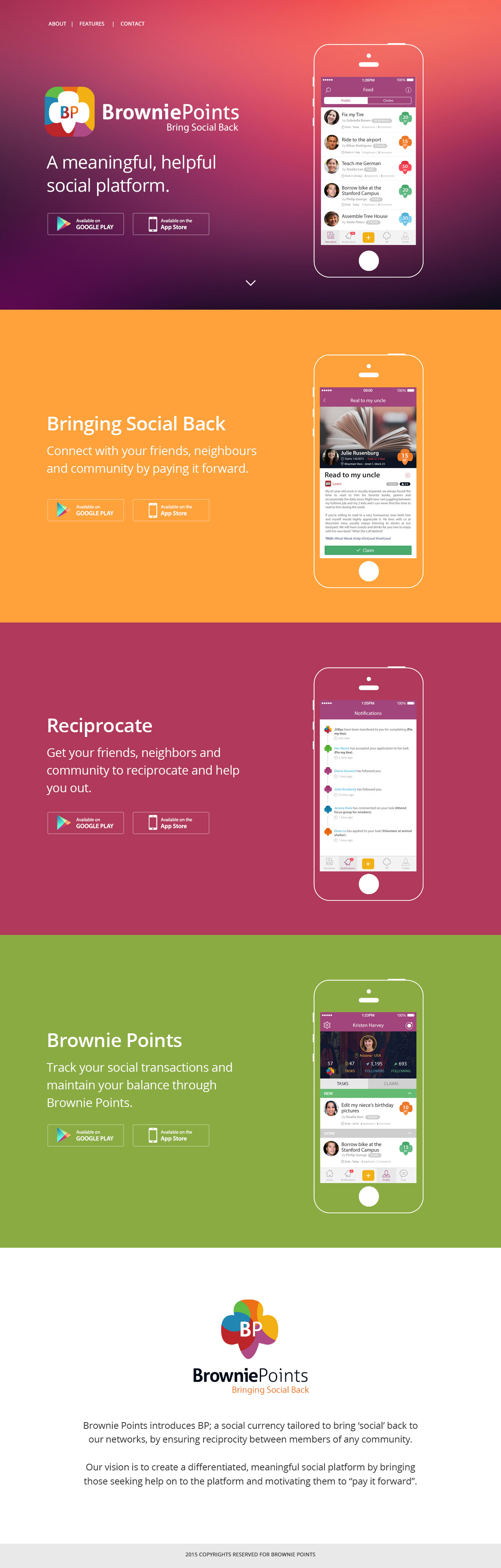
Brownie Points is a social currency tailored to bring ‘social’ back to our networks, by ensuring reciprocity between members of any community.
The vision is to create a differentiated, meaningful social platform by bringing those seeking help on to the platform and motivating them to “pay it forward”.
- Build a product theme from scratch, inlcuding Branding, Illustrating, UX Concept and colorful UI Design for the Mobile App; as well as a Landing Page.
Brown Stamps: A popular marketing practice employed by many stores in post-World War II US was the distribution of stamps with each purchase. The number of stamps given out varied with the amount of the purchase. These stamps were collected by customers and later redeemed for household gifts. The earliest of these stamps were brown in color and known as "brown stamps" or "brown points." The relationship between a purchase and the collection of these "brown points" equated with doing a good thing (supporting the local vendor) and getting a bonus (the valuable stamps). Purportedly, the collection of these "brownie points" eventually evolved into the usage with which we're familiar today.[citation needed] The term Browniepoints is still used as a marketing practice in business today by a New Zealand power company and also used by a gift service.
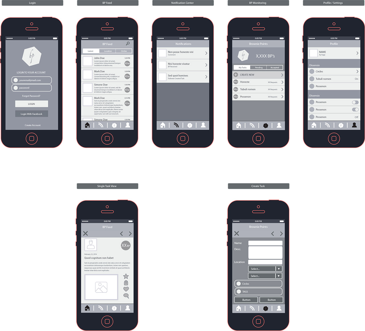
The phase of setting "How the App. works?" was the hardest and longest phase on all of the team, but finally after many rounds of thoughts and feedback; those are the very first wireframes (with help from Founder: Nabil Rostom):
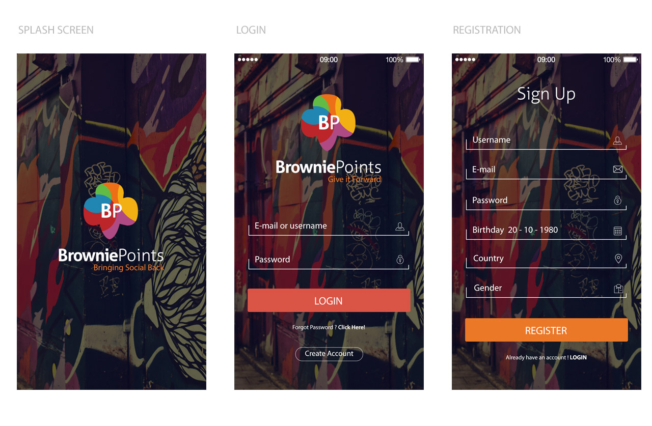
- This is how I built and started the main theme, Adding the colorful logo into a blurred dark filtered background; with a slightly move in background with the swipping.
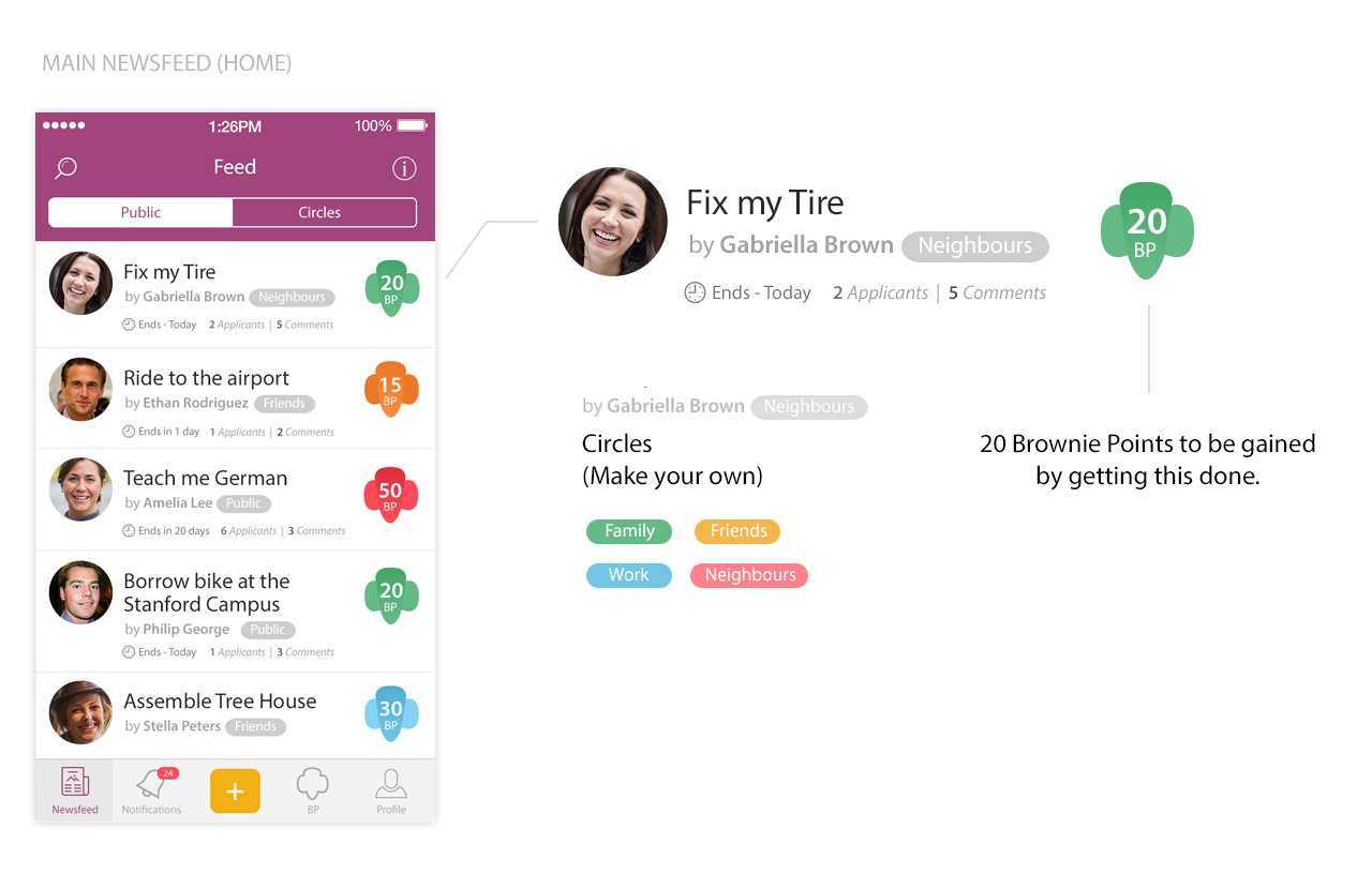
We had many debates on this particular page; as it is one of main screens that organizes the whole concept. We first thought of adding a picture of the task "favour" instead of profile picture. But what if those favours can't be represented in photos ? What If I needed to know directly who is asking for help without reading name or details ? sure adding profile picture would be more reasonable, here comes the final result:
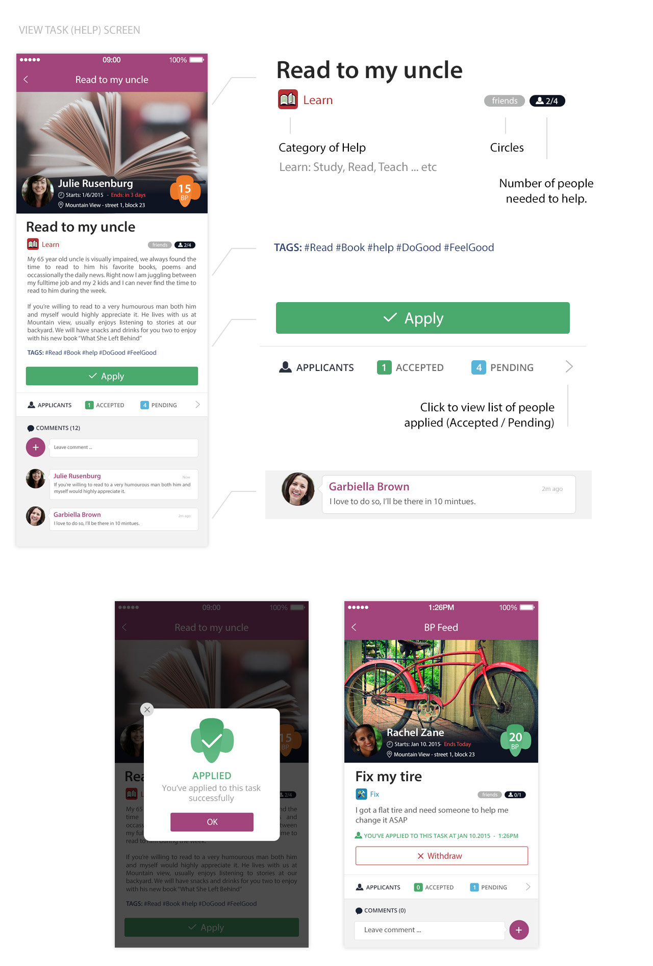
In this view you'll have the full details of a single task (favor); owner, description, due date, BP offered, number of people needed, "Apply" option as well as to check a list of people already applied either accepted or pending, and sure with an integrated comment system on each task to enrich the engagement and make the communcation much faster, This is an overview:
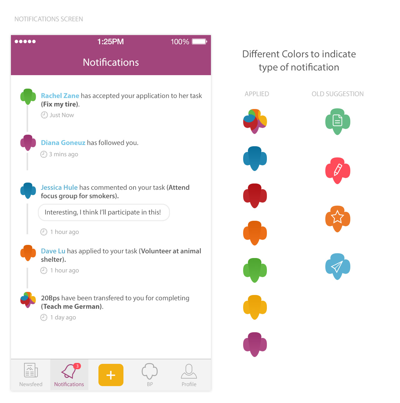
Colorful screen to indicate each notification type; keeps you updated with all your progress and what your friends are doing with their BPs.
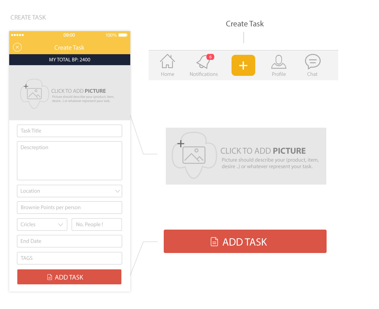
This is a simple "Form" screen, collecting the very basic and needed data for you task; including location, BP per person, Circles (Friends - Work - ..etc), Number of people needed, Due Date and Tags! I loved to make it with different color "Yellow" than the main "Purple" theme just to bare in mind that yellow is for creating new tasks.
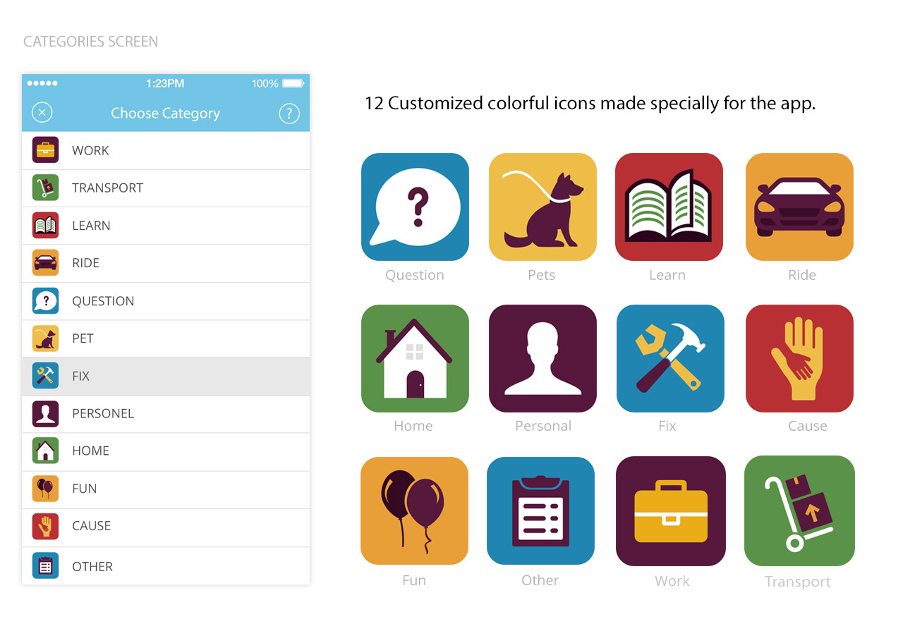
Adding different 12 categories to make it easy to sort/organize tasks and claims in your newsfeed; examples like Work, Pets, Questions, Learn, Ride and Fix.
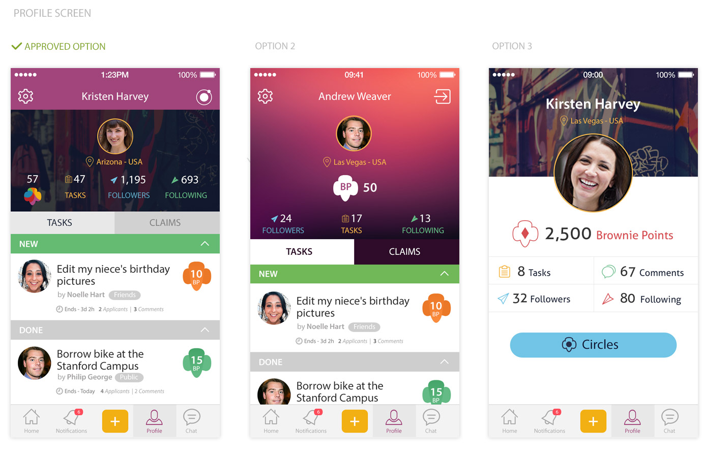
After few talks we reached to such three designs, each has the same exact data but different way of representing: Your Tasks & Claims, Followers & Following, Total BPs and a quick access to settings and Circles.
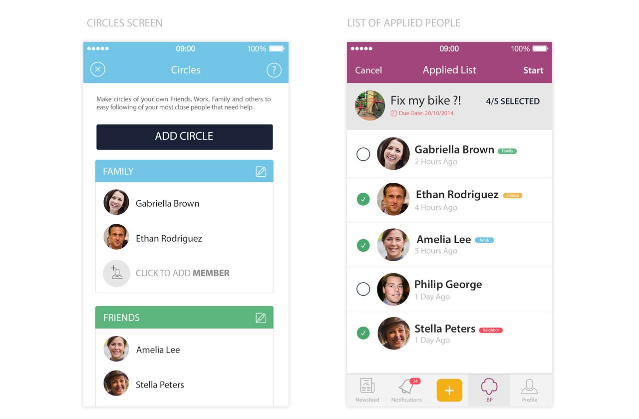
Sub-screens to make it easy to Add/Edit your Circles and its members, I choosed this light blue color to make circles remarkable than the usual purple; as well as a screen of Applied people in each single task; attached with options to select & start.
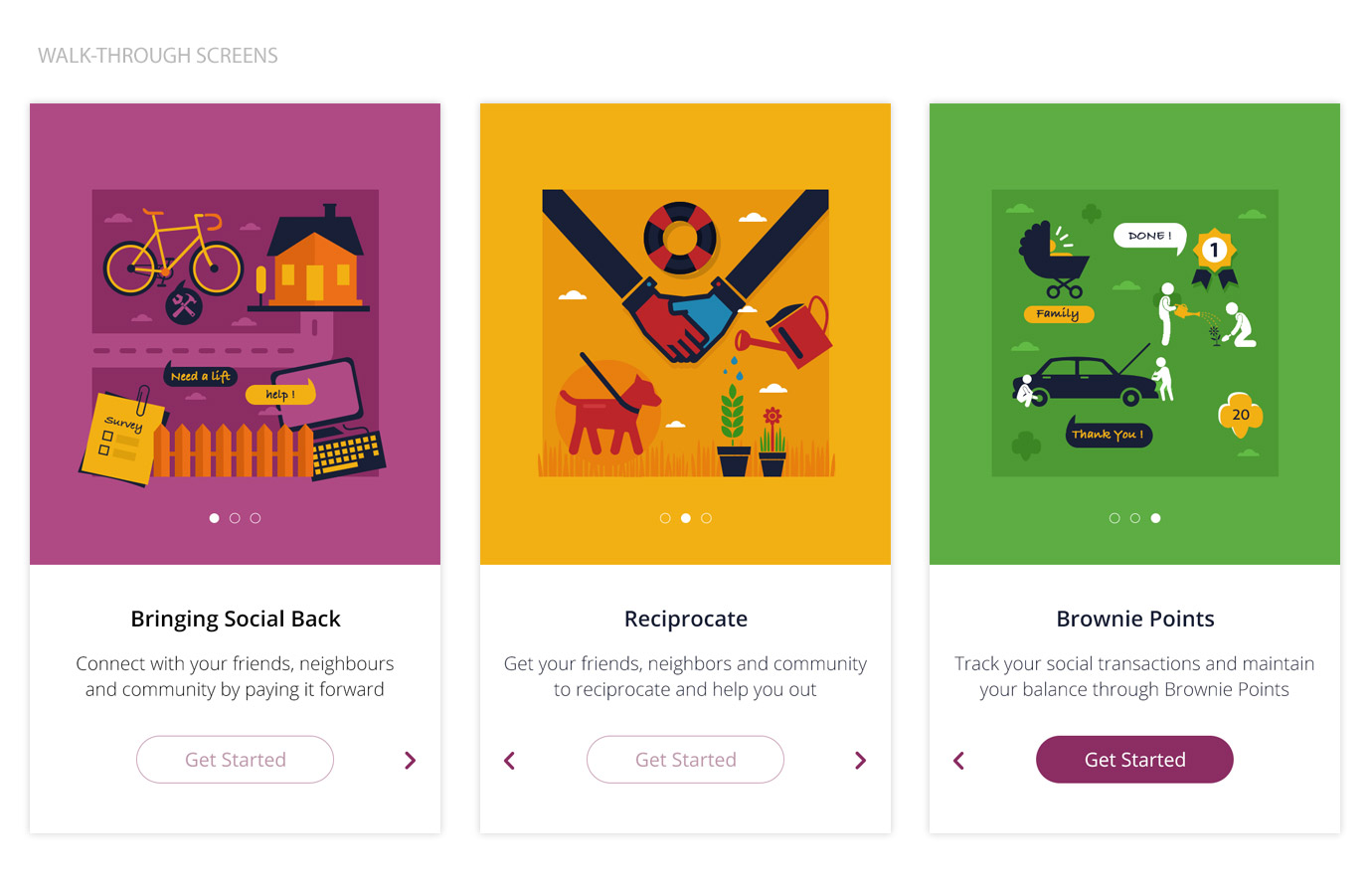
Customized hand-made illustrations to briefly describe the App. by adding them as a walk-through screens once you first time started the App.
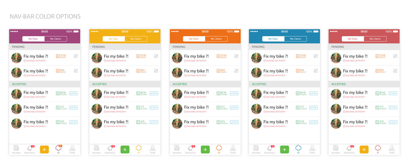
We had many debates to settle on a specific color to be used all over the App., most votes: Blue & Purple. Since blue has been used very commonly in many Apps. we then went for Purple and "Yellow" as main button, Have a look:
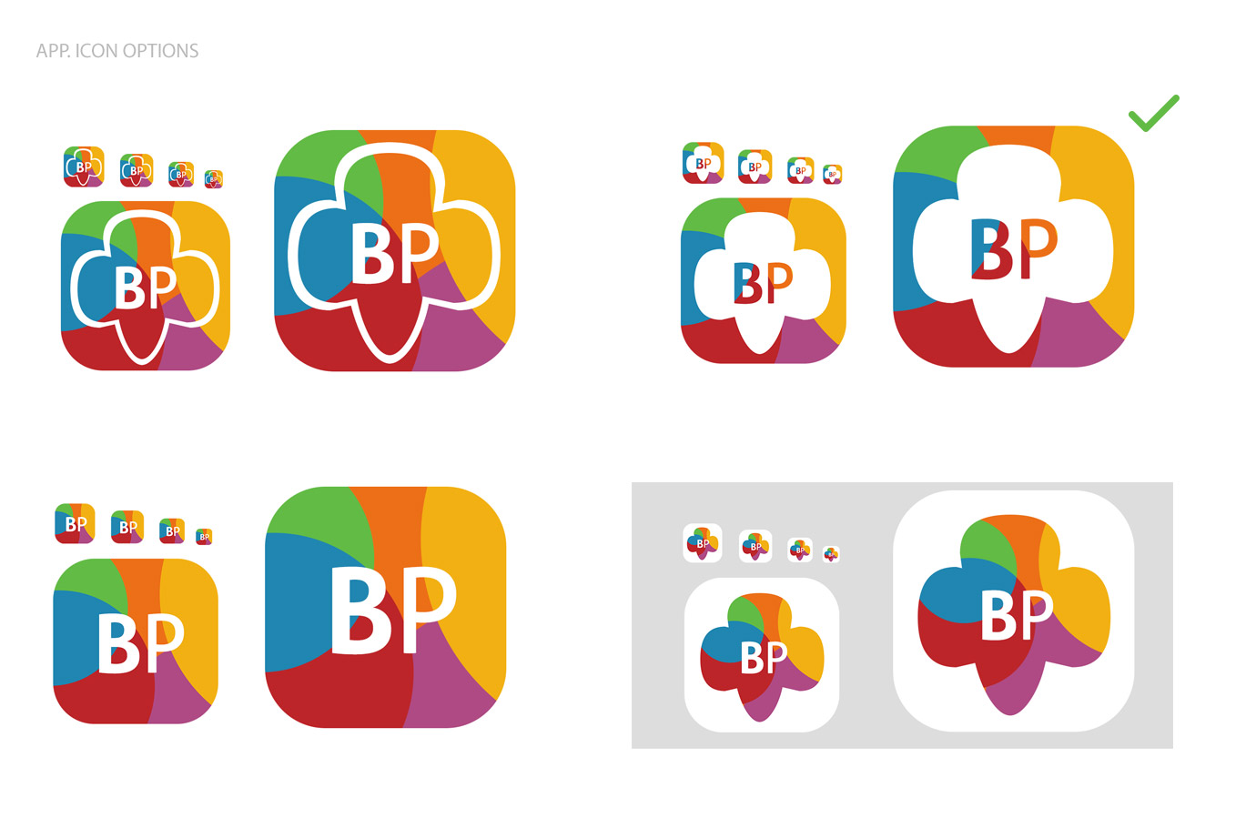
Having four diffrent App. icon styles to be used; only one winner !
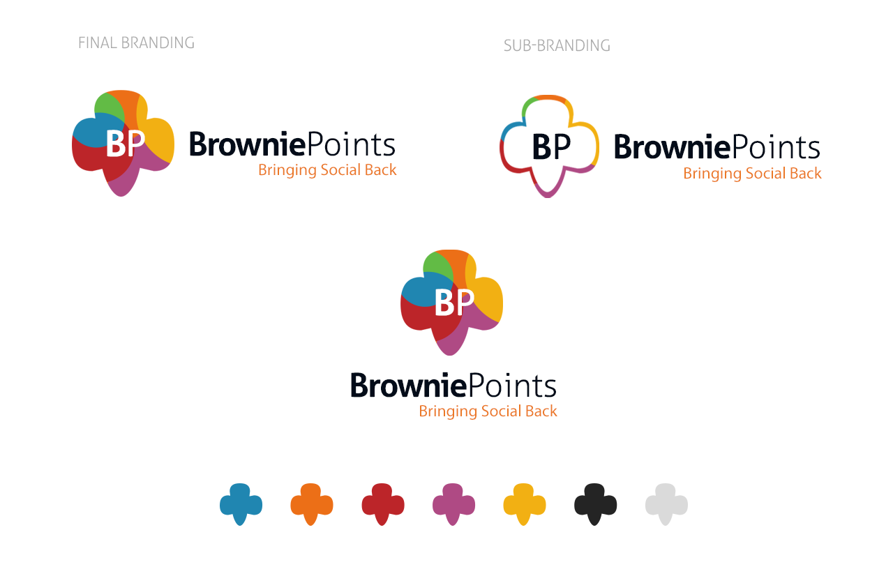
This was our last step in the whole process; a simple single-page in colorful colors to represent the identity, idea and prototype version.
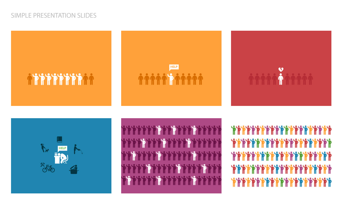
Simple Slides to be used as presentation for "How the app is working?"; with clear illustrations to get you the whole idea in a glance.
© 2015 All Rights Reserved / A Product Designed in "Ventures Dash".
More about the team on: Angel-List